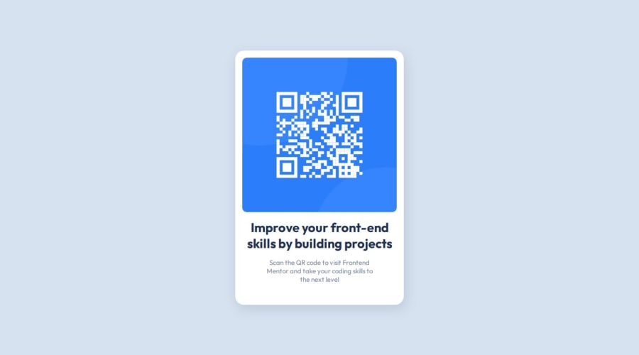
Design comparison
Solution retrospective
As I mentioned earlier, using variables with CSS is a great practice in my opinion. Even in a small project like this, it already helps a lot in development. Next time, I would make better use of class.
I had difficulty with alignments, both for texts and boxes. I had to review past studies and consult my previous codes to overcome these challenges. Additionally, I received help from a friend who gave me a small push in development.
What specific areas of your project would you like help with?I would like help with alignment because I still feel a certain difficulty in getting the alignments right. However, I believe that with a little more practice, this will become easier. I still feel lost with display: flex and its properties, but I will be practicing. I believe this was my biggest challenge; the rest was a smooth process.
Community feedback
- @DylandeBruijnPosted 10 months ago
Hi @BrianMunizSilveira,
Great job on your completing your project it looks very close to the design specifications. I like that you took the time to write a detailed retrospective.
A bit of friendly constructive feedback:
-
Try putting a bit of
paddingon the left and right of yourbody. Or wrap your card in a separate container that applies this spacing. This is recommended so your card has some spacing between the sides of the browser on smaller viewports. -
Nice use of a reset stylesheet. I would give your main CSS file a more descriptive name however, like
main.css,style.cssorstyles.css. Other developers will then have an easier time knowing where the styles come from. -
I suggest using
min-height: 100vhinstead ofheight: 100vhon thebodyelement. If your content ever grows and it exceeds theheightof100vhyou'll run into overflow issues. -
I suggest using a
ptag for your description instead of aspan. This is a little bit more semantic. Aspanis generally used to style a specific piece of text inside aporh1for example.
If you have any questions about flex specifically I would be happy to answer them.
I hope you find my feedback helpful!
Marked as helpful1@BrianMunizSilveiraPosted 10 months agoHi @DylandeBruijn
Thanks for all your feedback, I will certainly apply these changes you suggested. Thank you for all the compliments, I'm trying to improve every day, but I still feel lost in some aspects, I'm glad you liked it and took the time to comment.
This really encourages me and motivates me to continue learning and doing various other projects. I'll be applying your suggestions soon. Thanks again.
I invite you to take a look at my GitHub profile, there are many others I've been working on and others I've already finished, but most of them may be in my native language (PT-BR), so I hope that's not too much of an obstacle.
1@DylandeBruijnPosted 10 months agoHi @BrianMunizSilveira,
No problem, I'm glad to help out! You have the right mindset and that's really important. It's alright to feel lost, CSS can be annoying and frustrating at times. In my opinion it's really valuable to master the fundamentals. If you know why things happen and how it fits together it will click more. But this takes time and practice of course! I'm glad I could inspire and motivate you to continue learning. I'll take a look at your other projects, if you have any questions feel free to reach out.
Marked as helpful1@BrianMunizSilveiraPosted 10 months ago@DylandeBruijn
Thanks, I'll be sure to message you when I need you! ✨
0 -
Please log in to post a comment
Log in with GitHubJoin our Discord community
Join thousands of Frontend Mentor community members taking the challenges, sharing resources, helping each other, and chatting about all things front-end!
Join our Discord
