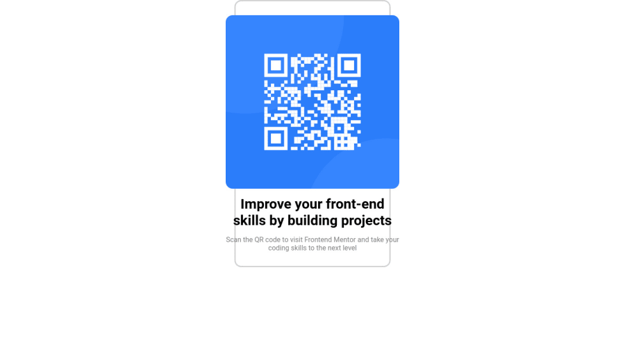
I used flexbox as a way to layout elements in the page.
Design comparison
Solution retrospective
This is my first challenge on frontend mentor, so let me know how my first challenge looks like compared to the original challenge image.
Community feedback
- @deveshshuklaPosted almost 2 years ago
Hey Naheen... starting is the main thing... You will learn more on the process... Just try to make the design as close as possible... If you are not getting desired output search for a solution, Actually in this way you will learn new web development concepts. This platform is all about learning things while doing... there is no time limit take your time & take it as a challenge to replicate the design as close as possible... I hope you understand. 🙂👍
Some Tips:
- For report warning use Html-5 recommended structure:
<main>Contain all body elements in this section</main> <footer>
- For content overflow use
overflow: hidden
Best of luck 👍
Marked as helpful0 - For report warning use Html-5 recommended structure:
Please log in to post a comment
Log in with GitHubJoin our Discord community
Join thousands of Frontend Mentor community members taking the challenges, sharing resources, helping each other, and chatting about all things front-end!
Join our Discord