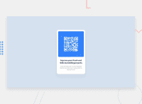
Design comparison
Community feedback
- @VCaramesPosted almost 2 years ago
Hey there! 👋 Here are some suggestions to help improve your code:
Congrats on completing your first challenge!🎊🎆
- Best practice ✅, before moving on to the next challenge, always check your FEM report, to see what is incorrect and update your code with it so that you would not make the same mistake over again. This something that should be done right after submitting your challenge.
- The
alt tagdescription for the “QR image” needs to be improved upon ⚠️. Its needs to tell screen reader users what it is and where it will take them to when they scan it.
- Change
widthtomax-width: 100%in your image to make it responsive. You will also want to remove theheightas it is unnecessary.
- For improved accessibility 📈 for your content, it is best practice to use
remfor yourfont-sizeand other property values. Whileemis best formedia-queries. Using these units gives users the ability to scale elements up and down, relative to a set value.
If you have any questions or need further clarification, feel free to reach out to me.
Happy Coding! 🎆🎊🪅
Marked as helpful1@VCaramesPosted almost 2 years ago@oussamaelomri
When you submit your project to the Frontend Mentor (FEM) site, it automatically checks your code for anything that is incorrect or needs improvement.
When viewing you challenge page, you will see it underneath the "Design Comparison" section.
1 - @oussamaelomriPosted almost 2 years ago
You have to delete the first / in image URL to display qr-code image. This is the right code: <img src=
images/image-qr-code.png>Marked as helpful0
Please log in to post a comment
Log in with GitHubJoin our Discord community
Join thousands of Frontend Mentor community members taking the challenges, sharing resources, helping each other, and chatting about all things front-end!
Join our Discord

