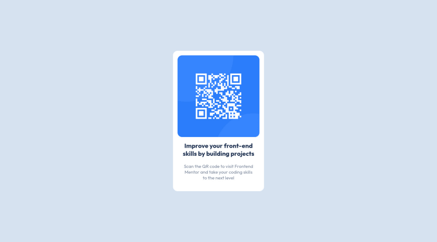
Design comparison
Solution retrospective
Hi everybody. This is my solution for my first challenge.
Community feedback
- @MelvinAguilarPosted over 2 years ago
Hi there 👋. Good job on completing the challenge ! I have some feedback for you if you want to improve your code.
HTML:
- Alternative text must not contain ".png" must be human readable.
- The
altattribute should explain the purpose of the image. Uppon scanning the QR code, the user will be redirected to the frontendmentor.io website, so a betteraltattribute would beQR code to frontendmentor.io
If you want to learn more about the
altattribute, you can read this article.CSS:
- Instead of using pixels in font-size, use relative units like
emorrem. The font-size in absolute units like pixels does not scale with the user's browser settings. This can cause accessibility issues for users who have set their browser to use a larger font size. You can read more about this here.
- Use
min-height: 100vhinstead ofheight: 100vh. Theheightproperty will not work if the content of the page grows beyond the height of the viewport.
I hope you find it useful! 😄 Above all, the solution you submitted is great!
Happy coding! 🎄
Marked as helpful1@tiago-roPosted over 2 years ago@MelvinAguilar. Thanks for your feedback! I really appriciated, and both of articles you put are really great!
1
Please log in to post a comment
Log in with GitHubJoin our Discord community
Join thousands of Frontend Mentor community members taking the challenges, sharing resources, helping each other, and chatting about all things front-end!
Join our Discord
