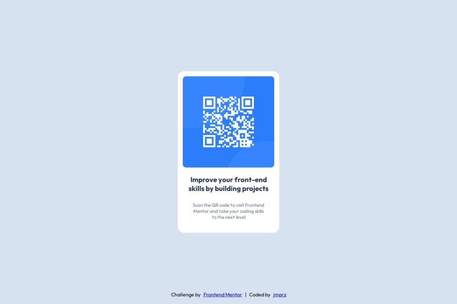
Design comparison
SolutionDesign
Solution retrospective
What are you most proud of, and what would you do differently next time?
Finishing the challenge is satisfying and I want to learn more. This is a good start to improve my skills on web design.
What challenges did you encounter, and how did you overcome them?I got hard time figuring out about the container of the image and text then I learn how to use flex, margin and padding. I'm also confused on making it responsive but then I open the Figma file (which is super useful!) to know the exact sizes of image and the spacing.
What specific areas of your project would you like help with?Does my code for the title and paragraph good? I didn't use the to perfectly center the text as seen on the preview designs. Is there other ways to improve the styling for centered text or paragraph?
Community feedback
Please log in to post a comment
Log in with GitHubJoin our Discord community
Join thousands of Frontend Mentor community members taking the challenges, sharing resources, helping each other, and chatting about all things front-end!
Join our Discord
