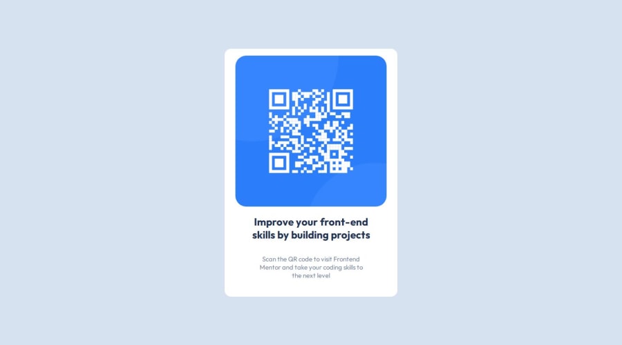
Design comparison
Solution retrospective
The CSS code is correct and also displays well in the deploy, but Frontend Mentor does not detect the Nesting in CSS so the screenshot it generates is incorrect...
Community feedback
- @Islandstone89Posted 9 months ago
Hello, Ruben. Good job, here are some suggestions:
HTML:
- The alt text must also say where it leads(frontendmentor.io).
CSS:
-
It's good practice to include a CSS Reset at the top.
-
Add around
1remofpaddingon thebody, so the card doesn't touch the edges on small screens. -
Remove all widths and heights.
-
Add a
max-widthof around20remon the card, to prevent it from getting too wide on larger screens. -
font-sizemust never be in px. This is a big accessibility issue, as it prevents the font size from scaling with the user's default setting in the browser. Use rem instead. -
To create the space between the image and the edge of the card, set
paddingon all 4 sides of the card. -
On the image, add
display: blockandmax-width: 100%- the max-width prevents it from overflowing its container.
Marked as helpful1
Please log in to post a comment
Log in with GitHubJoin our Discord community
Join thousands of Frontend Mentor community members taking the challenges, sharing resources, helping each other, and chatting about all things front-end!
Join our Discord
