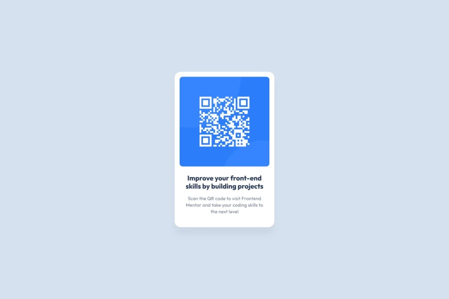
Design comparison
Solution retrospective
This is my second project as part of the Fronted Mentor challenges, using only HTML and CSS.
Feel free to tell me how I can improve and if there are better ways to achieve the final result.
I have taken advice that they gave me from my first project, such as:
@SinisaVukmirovic: "try to use semantic elements in your HTML". I have used <maid>, <figcaption> and <section> for this challange. And the styles I have put in a separate CSS file
@Nadine-Green: Helped me how to center the elements.
@vcarames: "The image’s alt tag description needs to be improved upon to better describe what it is." I have tried to be more specific and put: alt="QR code to enter Frontend Mentor" class="qr_code"
One of the things that is most difficult for me is making the images and elements, with automatic size depending on the size of the device screen, aspects such as what value to use in the width and height, flex box has helped me but I feel that I still need to master that part, if you have any link or advice to improve on this, I would really appreciate it.
Community feedback
- @AdrianoEscarabotePosted almost 2 years ago
Hello orlando-caceres, how are you? I truly loved your project's outcome, however I have some advice that I hope you'll find useful:
To improve the responsiveness of the project, we can make some changes
.qr_code {
    width: 100%;
    max-width: 300px;
    height: auto;
    border-radius: 10px;
}
.main {
    max-width: 330px;
    height: auto;
    width: 100%;
}
Instead of using "width" to specify an absolute width, use "max-width" to specify a maximum instead. By doing this, the content will behave much more amiably in smaller resolutions, making it easier to make the project responsive.
The remainder is excellent.
I hope it's useful. 👍
Marked as helpful0@orlando-caceresPosted almost 2 years ago@AdrianoEscarabote
Wow thank you so much, just what I needed. By the time the screen became smaller, the design changed a bit and I didn't know how to maintain it, but this helped me and to know how to do it.
1 - @MelvinAguilarPosted almost 2 years ago
Hi @orlando-caceres 👋, good job completing this challenge! 🎉
I have some suggestions you might consider to improve your code:
Concepts related to site accessibility:
- Figure elements (
<figure>) should only be used when captions are required with<figcaption>, you can directly use the <img> or <div> tag directly in this solution. A figure element without a caption would be considered at the same semantic "level" as using a div element, in which case the caption would provide a title to the figure.
- Even though this challenge is not a full page, you should use semantic tags and a title tag
<h1>in your solution. Inside your 'main' element, you can create an '<h1>' that will not be visible visually but is visible to screen-readers. To hide content visually, you can use the sr-only class. You can copy the styles of this class here.
<h1 class="sr-only">QR Card Component</h1>- The <p> with text "Improve your front-end skills by building projects" , is considered a heading element, change it to an <h2>.
- Instead of using pixels in font size, use relative units of measure like
remorem. The font size in absolute length units (px) does not allow users with limited vision to change the text size in some browsers. You can read more about this problem here.
To improve your solution on mobile devices 📱:
- Update the image selector to make responsive images:
qr_code {
    width: 100%;
    /* width: 300px; */
    /* height: 300px; */
    border-radius: 10px;
}
Above all, the project is done well👏. I hope those tips will help you! 👍
Good job, and happy coding! 😁
Marked as helpful0@orlando-caceresPosted almost 2 years ago@MelvinAguilar
Thanks for the help, I'll take it into account.
Font size and responsive images are important issues, thanks for the info.
1 - Figure elements (
- @orlando-caceresPosted almost 2 years ago
I have a question, why in the DESIGN COMPARISON section, where solution/design appears together with a screen to compare the challenge with the solution, the solution that I have uploaded is different from the one that appears in this part, for example my solution It has two lines in dark blue and three lines in gray, just like the image of the challenge. But in this comparison section, it seems that my solution has three lines in dark blue and if you enter the code you will only see two, I don't know if I am making myself understood? Does this happen to anyone else or why does it happen to me? The same thing happened to me with the product card challenge.
0@MelvinAguilarPosted almost 2 years ago@orlando-caceres I see your solution well on my computer and in different browsers, Maybe the screenshot was taken when the browser used some default style you didn't notice. A possible solution: You could use a CSS Reset to remove browser built-in styles and reduce browser inconsistencies.
Popular reset style sheets:
Marked as helpful0@orlando-caceresPosted almost 2 years ago@MelvinAguilar
Thanks, I'll use css reset in my next project.
1
Please log in to post a comment
Log in with GitHubJoin our Discord community
Join thousands of Frontend Mentor community members taking the challenges, sharing resources, helping each other, and chatting about all things front-end!
Join our Discord
