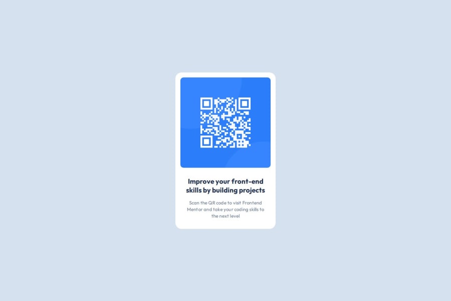
Design comparison
Solution retrospective
Its my first submission afterall , so I am happy and am proud about it.
What challenges did you encounter, and how did you overcome them?While developing this simple website I faced a lot of challenges mainly from using Figma , Git, Github , what could be a better semantic markup, css designing dificulties , naming conventions and all. I know that things won't be good at first place but I want to still try.
What specific areas of your project would you like help with?First of all thank you frontendmentor and team for these challenges and such a well-knit community. I want you guys to review my submission and give me inputs where I am lacking , where I could do better , CSS design principles I should follow and to develop pixel perfect websites .
Community feedback
- @Islandstone89Posted 3 months ago
Hey, great job! Your HTML is really good, and I like your use of CSS Custom Properties.
Here are some improvements to make your solution even better:
HTML:
- You should not include words like "image" or "photo" in alt text. Screen readers start announcing images with "image", so your alt text would currently be read like this: "image, qrcode image of the card component". The alt text must also say where it leads(the frontendmentor website). A good alt text would be "QR code leading to the Frontend Mentor website."
CSS:
-
Including a CSS Reset at the top is good practice.
-
I like to add
1rem
ofpadding
on thebody
, to ensure the card doesn't touch the edges on small screens. -
Use the style guide to find the correct
font-family
, and remember to specify a fallback font:font-family: 'Outfit',sans-serif;
-
Remove all widths and heights in
px
. -
Add a
max-width
of around20rem
on the card, to prevent it from getting too wide on larger screens. -
letter-spacing
must not be inpx
. You can useem
, where1em
equals the element's font size. -
On the image, add
display: block
andmax-width: 100%
- the max-width prevents it from overflowing its container. -
To create the space between the image and the edge of the card, set
padding
on all 4 sides of the card:padding: 16px;
.
Marked as helpful1@krkfpoPosted 3 months ago@Islandstone89 Thank you, for the valuable inputs sir . It was really helpful.
1
Please log in to post a comment
Log in with GitHubJoin our Discord community
Join thousands of Frontend Mentor community members taking the challenges, sharing resources, helping each other, and chatting about all things front-end!
Join our Discord