Design comparison
SolutionDesign
Solution retrospective
What specific areas of your project would you like help with?
Feedback is welcome
Community feedback
- @tristanjtatePosted 18 days ago
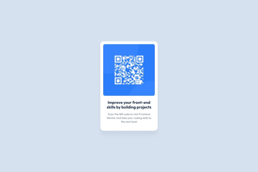
Great work! Code looks clean as well. I think the spacing/margin between some of the elements could be increased(Mine was actually too much - looked too tall). Lastly, your QR image uses box shadowing which wasn't utilized in the design making it pop out(Again, I did the same thing but to the whole container). Little things...we both had similar bits for improvement. Overall, very good. Good luck on next one!
0
Please log in to post a comment
Log in with GitHubJoin our Discord community
Join thousands of Frontend Mentor community members taking the challenges, sharing resources, helping each other, and chatting about all things front-end!
Join our Discord
