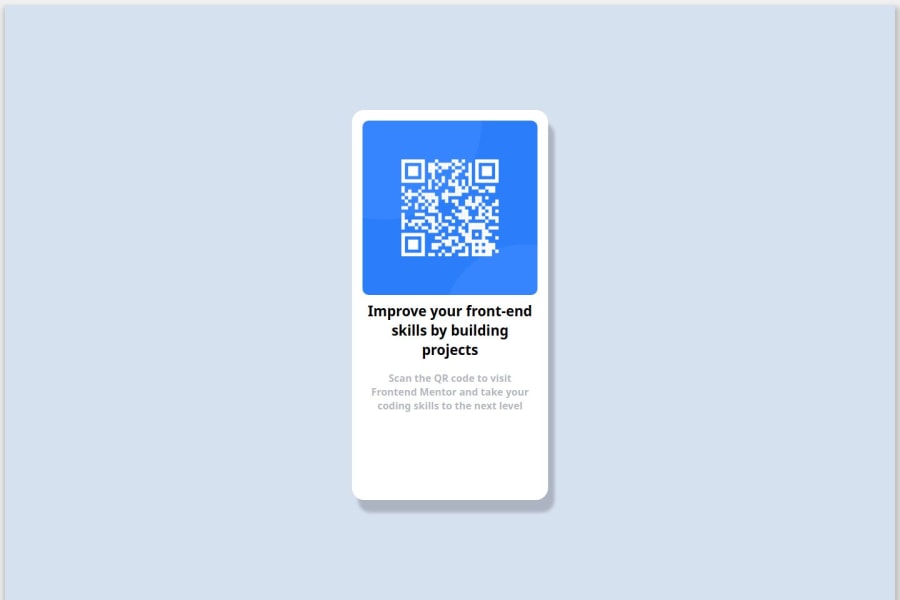


Design comparison

Solution retrospective
I am most proud of the responsive design. In every media quaries added, i add different properties based on the max-width. Making sure that it will be displayed as in the design given. But it display different after i upload it on github pages. Next time, I would plan my code structure better before starting development. While working on this project, I realized that some parts of my code could have been more organized and reusable.
What challenges did you encounter, and how did you overcome them?I faced a lot of problems. Make the card stay at the center even the width or the height change. Don't forget to mention the text inside it, that keep overlapping every media max-width changes. But i manage to overcome it by looking at the tutorials from youtube and similar problems from stack overflow. There also problem when i try to make it appears responsive on mobile size (375px), the container's margin cannot be changed in media (max-width: 375px). After, set the max-width into 376px, it worked. The margin changed.
What specific areas of your project would you like help with?Since i am still new to css, i would like to get to get tips on making responsive pages and what to configure after upload it on github pages. It displayed different.
Community feedback
Please log in to post a comment
Log in with GitHub
Join our Discord community
Join thousands of Frontend Mentor community members taking the challenges, sharing resources, helping each other, and chatting about all things front-end!
Join our Discord