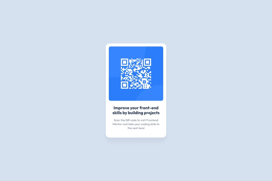
Design comparison
SolutionDesign
Community feedback
- @SidharthSreekumarPosted about 1 year ago
This is a great start and the component looks very similar to the design. Here are some places where I would improve:
- You can make this more accessible by using semantic HTML.
- Try adding the Outfit font which is used in the design.
- Maybe add some padding to the div with class "qrcode".
- Elements can be centred by different methods. You can try the following.
.qrcode-body {
  display: grid;
  place-items: center;
}

If you use the above code, there won't be a need to add margin left to "qrcode".

Hope this helps!
0
Please log in to post a comment
Log in with GitHubJoin our Discord community
Join thousands of Frontend Mentor community members taking the challenges, sharing resources, helping each other, and chatting about all things front-end!
Join our Discord
