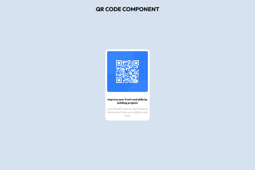
Submitted about 1 year agoA solution to the QR code component challenge
QR CODE COMPONENT
@DanyalSarwar325

Solution retrospective
What are you most proud of, and what would you do differently next time?
I learned to write a clean code without hardcoding the css. Hoping to make improvement in my design
What challenges did you encounter, and how did you overcome them?It was easy and basic task,I enjoyed it.
Code
Loading...
Please log in to post a comment
Log in with GitHubCommunity feedback
No feedback yet. Be the first to give feedback on Danyal Sarwar's solution.
Join our Discord community
Join thousands of Frontend Mentor community members taking the challenges, sharing resources, helping each other, and chatting about all things front-end!
Join our Discord