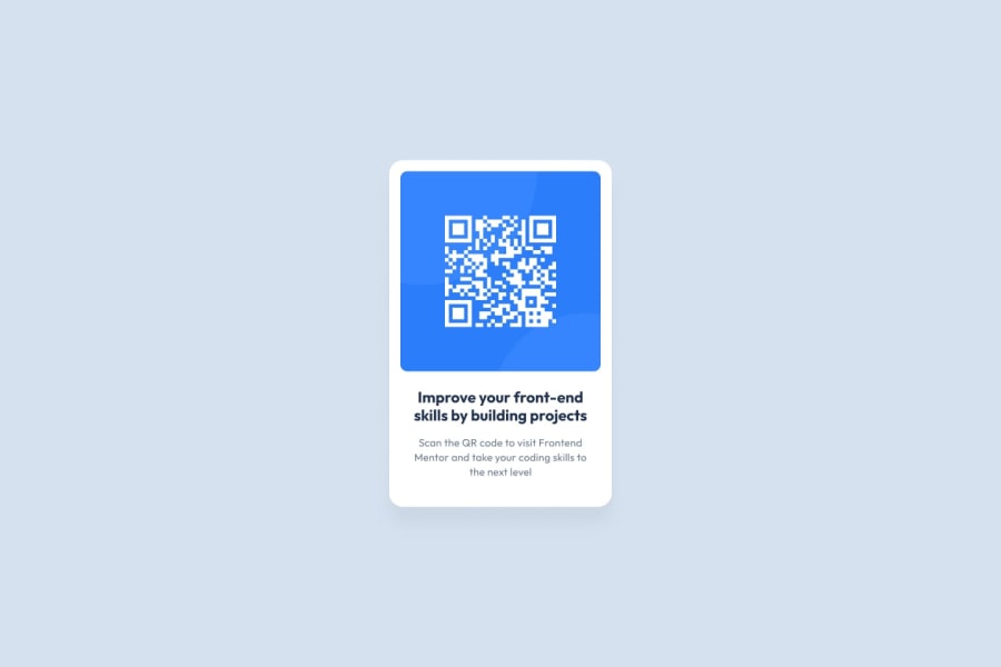
Design comparison
SolutionDesign
Solution retrospective
My first solution on this platform
Community feedback
- @Umer-KhokharPosted over 1 year ago
Hi there, You should add some of the padding of top, bottom to the container because spacing in such cards made our designs attractive. One thing more that it is always a good to add lighter colors text for the cards i.e. gray, balck bluish, bluish gray etc. Otherwise, you code and design looks pretty good. Good Luck for your coding Journey 😊
Marked as helpful0
Please log in to post a comment
Log in with GitHubJoin our Discord community
Join thousands of Frontend Mentor community members taking the challenges, sharing resources, helping each other, and chatting about all things front-end!
Join our Discord
