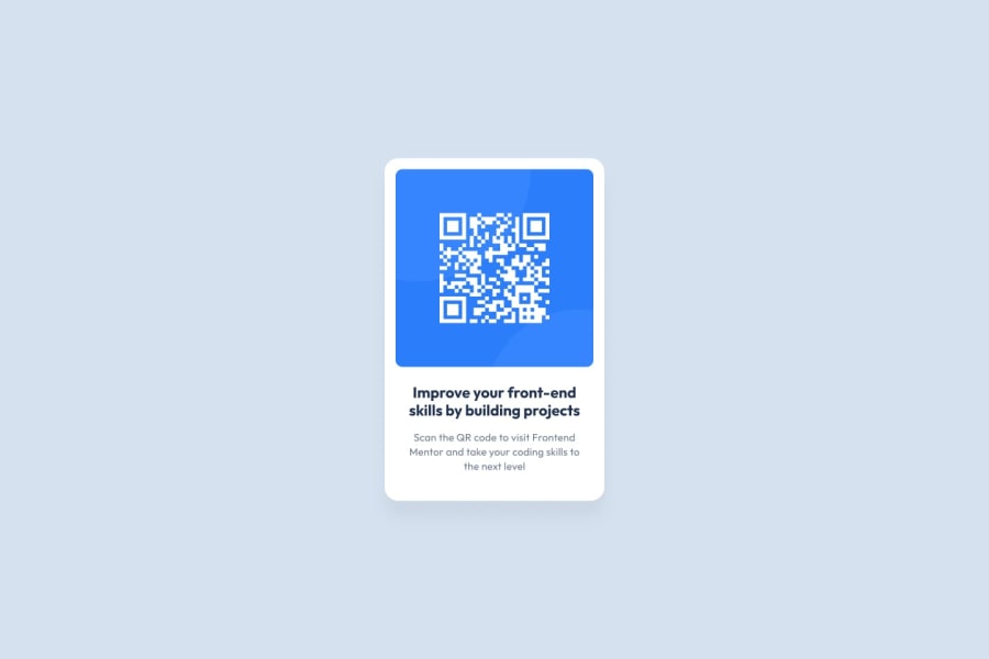
Design comparison
Community feedback
- @catherineisonlinePosted almost 2 years ago
Cool solution!
To improve semantics, make sure to wrap the entire code in the main tag not including header or footer tags. It will help to remove report issues and improve accessibility as well.
IF THIS WAS HELPFUL PLEASE MARK IT AS HELPFUL 🤩
Marked as helpful0 - @marekbrzePosted almost 2 years ago
Hello!
I recommend switching from using px units to rem units. This way people will be able to scale the website easily, and it will provide better consistency. Otherwise great and clean implementation! Great job!
Marked as helpful0 - @Nadine-GreenPosted almost 2 years ago
HEY RIYA!
I would like to give a few tips on how your solution could be improved upon,
-
You will need to increase the
border-radiusof both the parent container and the image, doing so will increase the similarity to the design. -
Concerning the current accessibility issues that you have, instead of using
divfor the<div class="card">, you could have used a more semantic element like amaininstead, you can learn more about semantic elements here
IF THIS WAS HELPFUL IN ANY WAY, DON'T HESITATE TO MARK IT AS HELPFUL :)
HAPPY CODING!
Marked as helpful0 -
Please log in to post a comment
Log in with GitHubJoin our Discord community
Join thousands of Frontend Mentor community members taking the challenges, sharing resources, helping each other, and chatting about all things front-end!
Join our Discord
