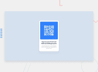
Design comparison
Solution retrospective
- Is my use of divs appropriate, or should I use more semantic elements?
- Is the CSS structured well?
Community feedback
- @correlucasPosted about 2 years ago
👾Hello Ricardo, congratulations for your first solution! 👋 Welcome to the Frontend Mentor Coding Community!
1.Great start and great first solution! You’ve done really good work here putting everything together, I’ve some suggestions you can consider applying to your code:Your component is done and the code is working, but the html markup/structure can be reduced by removing unnecessary divs, all you need is a single
<main>or<div>to keep all the content inside, and nothing more. The ideal structure is thedivand only the image, heading and paragraph.Here’s a minimal html structure for this challenge:
<body cz-shortcut-listen="true">
<div class="card radius shadow">
<img src="./images/image-qr-code.png" class="radius" alt="qr code image links to frontendmentor.io">
<h1>Improve your front-end skills by building projects</h1>
<p>Scan the QR code to visit Frontend Mentor and take your coding skills to the next level</p>
</div>
</body>
2.Here’s a good guide for writing a concise and clean code: https://altcampus.school/posts/writing-semantically-correct-and-clean-html
3.You can use
relative unitsasremoremthat have a better fit if you want your site more accessible between different screen sizes and devices.REMandEMdoes not just apply to font size, but to all sizes as well.✌️ I hope this helps you and happy coding!
Marked as helpful1 - @AdrianoEscarabotePosted about 2 years ago
Hi @rmartinez809, how are you?
You did a great job on this challenge, but I have a few tips I think you'll like:
1- Document should have one main landmark, you could have put all the content inside the
maintag, it would make the code more semantic. click hereTo get cleaner code you could have done like this:
mainimgh1pThat's all you need for this challenge!
The rest is great. Hope it helps... 👍
Marked as helpful1@rmartinez809Posted about 2 years ago@AdrianoEscarabote Very helpful thank you! I love your solution with the Dark/Light theme btw!
1
Please log in to post a comment
Log in with GitHubJoin our Discord community
Join thousands of Frontend Mentor community members taking the challenges, sharing resources, helping each other, and chatting about all things front-end!
Join our Discord

