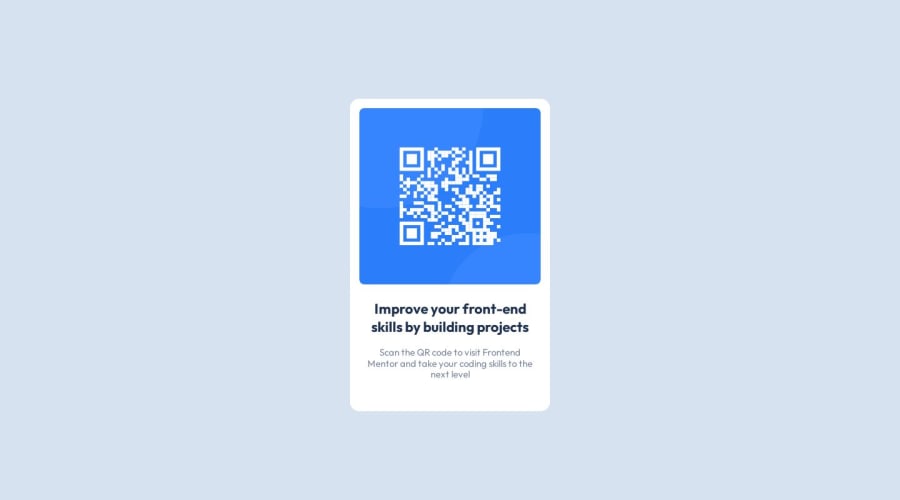
Design comparison
SolutionDesign
Solution retrospective
Greetings. I would appreciate any recomendations and feedback about the challenge. Thanks for your time, Happy Coding
Community feedback
- @Mennatallah-HishamPosted about 1 year ago
Hi ra001,
You did great 👍
Here are some suggestions to improve your code:
Semantic HTML
- wrap your content in <main>,this element represents the dominant content of the <body>
- wrap your card in <article>
<main class="main">
<article class="card">
</article>
</main>
Headings
- each page should have one h1 tag,h1 helps the web understand the content. also skipping h1 may confuse assistive technology users.
<h1>Improving your front-end skills by building projects</h1>ALT
- images should have descriptive alt text, which is important for SEO and screen reader users,alt="QR code linking to Frontend Mentor challenges"
SEO
- you can add meta description for better SEO, it provides a brief summary of a web page
<meta name="description" content="..........."/>here are some helpful articles:
Hope you find this helpful, Happy Coding
Marked as helpful0@RPRd001Posted about 1 year ago@Mennatallah-Hisham Thank you for the tips and the links, I will apply all the recommended corrections on the repository. Happy Coding
0
Please log in to post a comment
Log in with GitHubJoin our Discord community
Join thousands of Frontend Mentor community members taking the challenges, sharing resources, helping each other, and chatting about all things front-end!
Join our Discord
