Not Found
Not Found
Not Found
Not Found
Not Found
Not Found
Not Found
Not Found
Not Found
Not Found
Not Found
Not Found
Not Found
Not Found
Not Found
Not Found
Not Found
Not Found
Not Found
Not Found

Submitted

QR Code Component

@SandyAstorga

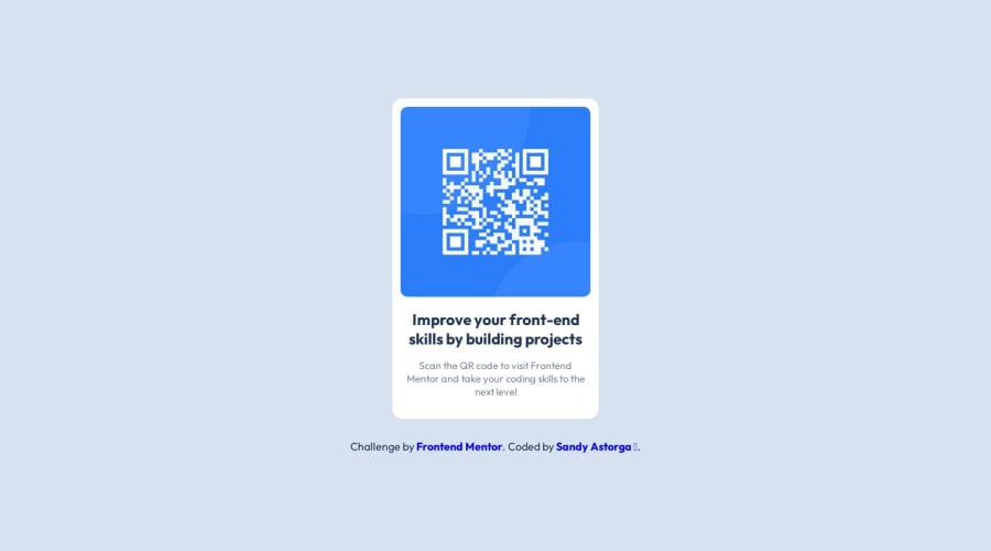
Desktop design screenshot for the QR code component coding challenge

This is a solution for...

  • HTML
  • CSS
1newbie
View challenge

Design comparison


SolutionDesign

Solution retrospective


What are you most proud of, and what would you do differently next time?

Every little project helps me to start and learn something new, this one in particular I felt was simple, it's more than anything to improve the responsive part.

What challenges did you encounter, and how did you overcome them?

The biggest challenge would be the responsive part, I think I handled the structure well.

What specific areas of your project would you like help with?

Everything related to responsive, a great area of opportunity.

Community feedback

@reteov

Posted

It still jumps in size, now at 501→500 pixels. Is there a reason for the @media element? Maybe I'm missing something.

0

@SandyAstorga

Posted

Hello again! In the middle I put a width of 90% below 500 px, so that the div would adapt to the size of the screen, I took that from a comment of a colleague, since, if I leave a fixed size, on larger screens it will look very small, in case I still need to learn more about responsive. 😊

0

@reteov

Posted

I have to admit, I did not know about the :root and the * elements, so it looks like I learned something here. Thanks!

There is the use of @media I'm not sure of, however. The same size box should also fit the minimum size of 375×667 and still have a little margin to work with. Once the browser passes 650 pixels across, it seems like the box grows.

While it might work for small buttons that need a significant increase for smaller screens, the increase in this case isn't really significant enough to make a difference in perception or interaction. If you can adjust the attribution line to equally fit under the box under all sizes, you should be able to drop the @media element altogether, and be fine.

0

@SandyAstorga

Posted

Thank you very much for the comments :D

0

@SandyAstorga

Posted

I made a couple of changes to improve the ratio, maybe it won't be very noticeable, you'll let me know what you think. Best regards

0

Please log in to post a comment

Log in with GitHub
Discord logo

Join our Discord community

Join thousands of Frontend Mentor community members taking the challenges, sharing resources, helping each other, and chatting about all things front-end!

Join our Discord