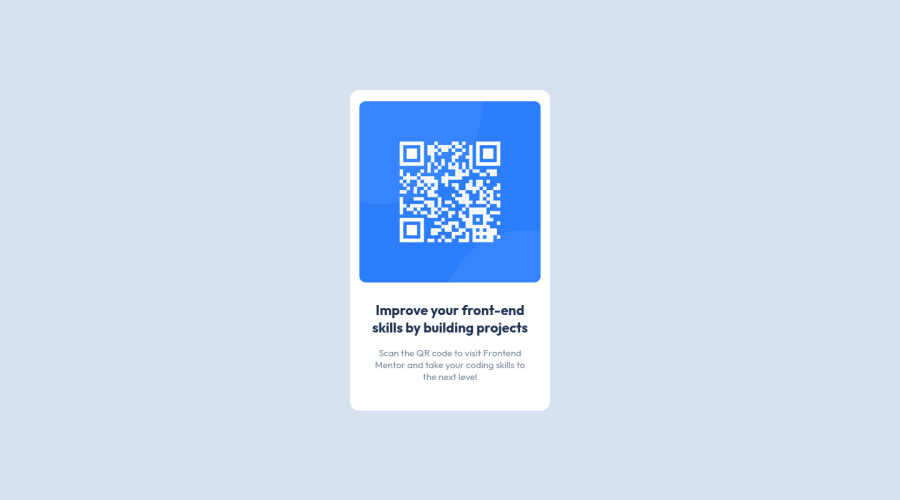
Design comparison
SolutionDesign
Solution retrospective
This is my solution, feel free to say any advice thanks!
Community feedback
- @VCaramesPosted almost 2 years ago
Hey there! 👋 Here are some suggestions to help improve your code:
- The
alt tagdescription for the “QR image” needs to be improved upon ⚠️. It’s needs to tell screen reader users what it is and where it will take them to when they scan it.
- Change ⚠️
widthtomax-widthin your component’s container to make it responsive.
- Change ⚠️
widthtomax-width: 100%in your image to make it responsive.
- Not needed ❌:
.main {
    display: flex;
    flex-direction: column;
    align-items: center;
}
.title { margin: 0; } .description { margin: 0; }- For improved accessibility 📈 for your content, it is best practice ✅ to use
remfor yourfont-sizeand other property values. Using this unit gives users the ability to scale elements up and down, relative to a set value.
If you have any questions or need further clarification, feel free to reach out to me.
Happy Coding! 🎆🎊🪅
Marked as helpful0 - The
Please log in to post a comment
Log in with GitHubJoin our Discord community
Join thousands of Frontend Mentor community members taking the challenges, sharing resources, helping each other, and chatting about all things front-end!
Join our Discord
