Design comparison
SolutionDesign
Community feedback
- @austin-tanksleyPosted 3 months ago
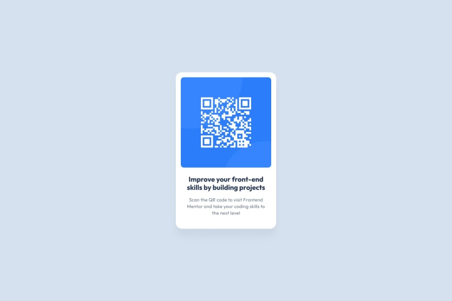
Hi Jandrie, great work on this! A couple adjustments I would make would be to make the body take up the full height of the preview pane, for this use 100vh. Another thing would be to adjust the font size of the heading to 22px to match the original design. And lastly, it is looking like the box shadow is missing from your card. Over all though it is very close. the sizing of the card looks accurate, and spacing feels in the ballpark. Nice job!
Marked as helpful0
Please log in to post a comment
Log in with GitHubJoin our Discord community
Join thousands of Frontend Mentor community members taking the challenges, sharing resources, helping each other, and chatting about all things front-end!
Join our Discord
