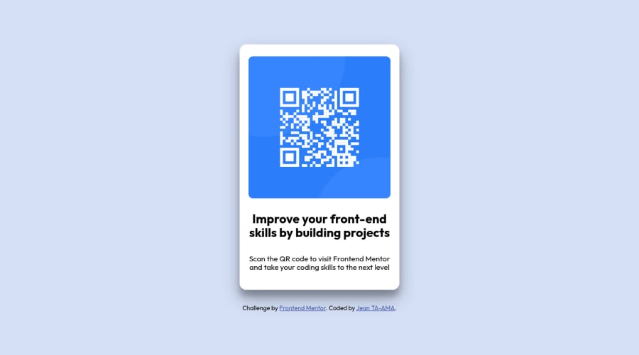
Design comparison
Community feedback
- @cryptosossoPosted over 2 years ago
Hi, @MelvinAguilar Thank you very much for your feedback and the resources. I'll use them for my other challenges.
1 - @MelvinAguilarPosted over 2 years ago
Hi @cryptososso 👋, good job on completing this challenge! 🎉
I have some suggestions you might consider to improve your code:
- Use the
<main>tag to wrap all the main content in your solution instead of using<div class="container">, also, there should only be one man tag.
- Instead of using pixels in font size, use relative units of measure like
remorem. The font size in absolute length units (px) does not allow users with limited vision to change the text size in some browsers. Reference.
- The container isn't centered correctly. There are two modern CSS techniques to center elements:
Using flexbox layout:
body {
   min-height: 100vh;
   display: flex;
   flex-direction: column;
   justify-content: center;
   align-items: center;
}
Using grid layout:
body {
   min-height: 100vh;
   display: grid;
   place-content: center;
}
Additionally, remove the margin to center the component correctly.
.container {
    /* margin: 0 auto; */
    /* margin-top: 100px; */
    /* margin-bottom: 15px; */
    . . .
}
Links with more information:
- The Complete Guide to Centering in CSS.
- A Complete Guide to Flexbox (CSS-Tricks).
- How TO - Center Elements Vertically (W3Schools).
- CSS Layout - Horizontal & Vertical Align (W3Schools).
I hope those tips will help you! 👍
Good job, and happy coding! 😁
1 - Use the
Please log in to post a comment
Log in with GitHubJoin our Discord community
Join thousands of Frontend Mentor community members taking the challenges, sharing resources, helping each other, and chatting about all things front-end!
Join our Discord
