

Design comparison

Community feedback
- @MelvinAguilarPosted about 2 years ago
Hello there 👋. Good job on completing the challenge !
I have some suggestions about your code that might interest you.
HTML 📄:
- Use the
<main>tag to wrap all the main content of the page instead of the<div>tag. With this semantic element you can improve the accessibility of your page.
- The text
Improve Your Front-End Skills by Building Projectsis considered a heading element (h1).
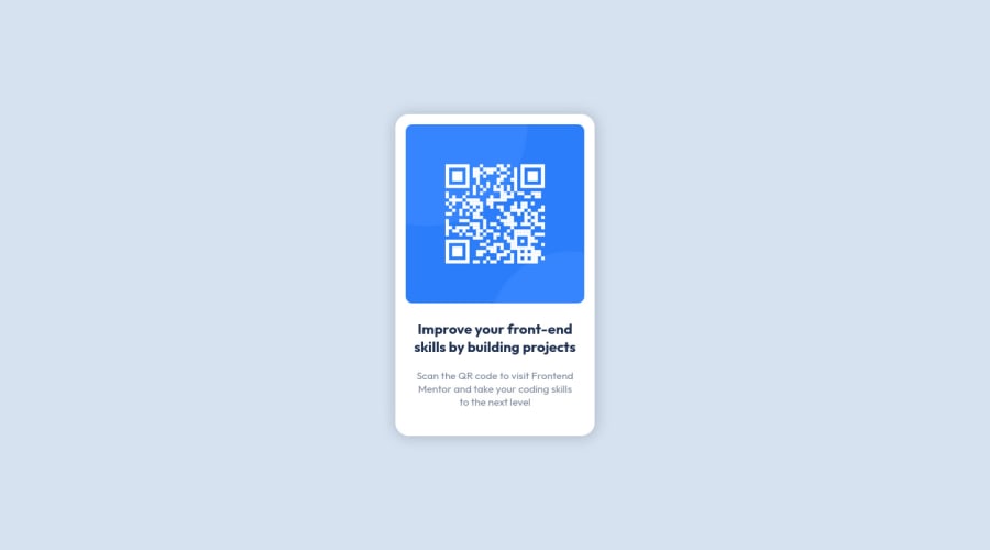
Alt text 📷:
-
The
altattribute should explain the purpose of the image. Uppon scanning the QR code, the user will be redirected to the frontendmentor.io website, so a betteraltattribute would beQR code to frontendmentor.ioIf you want to learn more about the
altattribute, you can read this article. 📘.
CSS 🎨:
- Centering an element with
position: absolutewould make your element behave strangely on some screen sizes, "there's a chance the content will grow to overflow the parent". You can use Flexbox or Grid to center your element. You can read more about centering in CSS here 📘.
body {
    font-family: 'Outfit', sans-serif;
    /* position: absolute; */
    /* top: 50%; */
    /* left: 50%; */
    /* transform: translate(-50%, -50%); */
    /* padding: 20px 0; */
    font-size: 15px; /* Use rem instead of px*/
    background-color: hsl(212, 45%, 89%);
    min-height: 100vh;
    display: grid;
    place-content: center;
}
I hope you find it useful! 😄 Above all, the solution you submitted is great!
Happy coding!
Marked as helpful1@Tauya2003Posted about 2 years ago@MelvinAguilar Thanks, your feedback really helped a lot especially the part on centering an element
1 - Use the

Please log in to post a comment
Log in with GitHubJoin our Discord community
Join thousands of Frontend Mentor community members taking the challenges, sharing resources, helping each other, and chatting about all things front-end!
Join our Discord