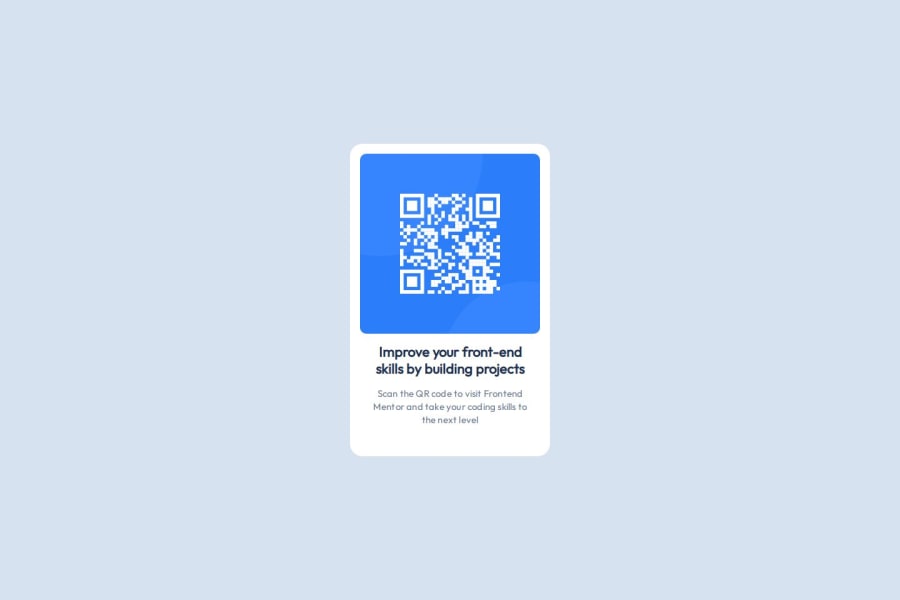
Design comparison
SolutionDesign
Solution retrospective
What challenges did you encounter, and how did you overcome them?
Having to guess the size of elements and fonts using images alone. I found that there are x2 different font sizes. Only one is provided in the file style-guide.md. I overcame this by opening the design file provided with Figma to get exact pixel sizes.
Community feedback
Please log in to post a comment
Log in with GitHubJoin our Discord community
Join thousands of Frontend Mentor community members taking the challenges, sharing resources, helping each other, and chatting about all things front-end!
Join our Discord
