Design comparison
Solution retrospective
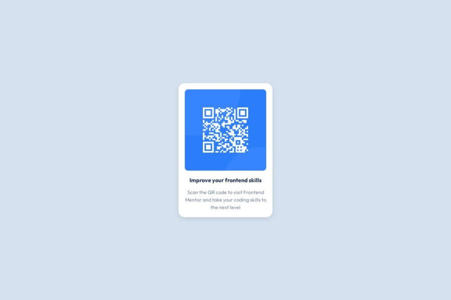
I'm proud of my ability to effectively use HTML and CSS to create a clean and responsive layout for the QR code component. The final product meets the design specifications and is visually appealing.
What challenges did you encounter, and how did you overcome them?Initially, I struggled with aligning the QR code image, title, and description to create a visually appealing layout. Ensuring everything was centered and looked good on different screen sizes was tricky.
The QR code image did not display properly on various devices, either being too large or too small, which affected the overall look of the component.
I initially encountered issues with linking my CSS file to the HTML document, which resulted in styles not being applied as expected.
Community feedback
Please log in to post a comment
Log in with GitHubJoin our Discord community
Join thousands of Frontend Mentor community members taking the challenges, sharing resources, helping each other, and chatting about all things front-end!
Join our Discord
