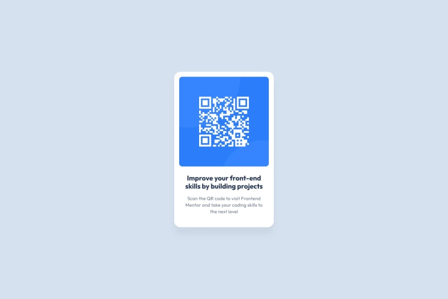
Design comparison
SolutionDesign
Solution retrospective
Hello, In this challenge I think I may have overdone it with the CSS - I reckon that it possibly could've been done in a much simpler way? So, I'm looking for any potential feedback on how to best potentially simplify CSS.
I am also concerned that I am reinforcing bad HTML coding habits, so if you see any mistakes or bad habits please feel free to let me know.
Thanks in advance
Community feedback
- @HugoHernPosted almost 2 years ago
- Your solution is really close to the original
- Your CSS looks great, its really clean and organized
- The only criticism I have is the spacing between elements
- It looks like you only need to tweak the font sizes in your html
Marked as helpful1 - @VCaramesPosted almost 2 years ago
Hey there! 👋 Here are some suggestions to help improve your code:
- The
alt tagdescription for the “QR image” needs to be improved upon ⚠️. Its needs to tell screen reader users what it is and where it will take them to when they scan it.
- The "Improve your front-end skill by building projects" is a heading ⚠️ in this component, so should be wrapped in an heading element.
- The
height: 500px;in the component’s container is not needed ⚠️.
- For improved accessibility 📈 for your content, it is best practice to use
remfor yourfont-sizeand other property values. Whileemis best formedia-queries. Using these units gives users the ability to scale elements up and down, relative to a set value.
If you have any questions or need further clarification, feel free to reach out to me.
Happy Coding! 🎆🎊🪅
Marked as helpful1 - The
Please log in to post a comment
Log in with GitHubJoin our Discord community
Join thousands of Frontend Mentor community members taking the challenges, sharing resources, helping each other, and chatting about all things front-end!
Join our Discord
