Design comparison
SolutionDesign
Community feedback
- @AliCamara20Posted 5 months ago
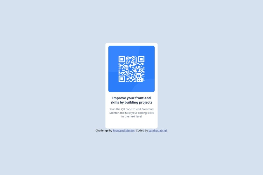
Good work, I just view the code and the semantics and other elements are all intact from my point of view. Nonetheless, I think the link below the QR component container should have a bit of a margin on the top from the container. Keep Smashing more Challenges.
0
Please log in to post a comment
Log in with GitHubJoin our Discord community
Join thousands of Frontend Mentor community members taking the challenges, sharing resources, helping each other, and chatting about all things front-end!
Join our Discord
