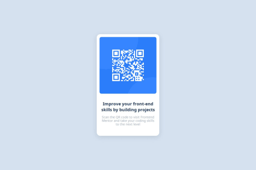
Design comparison
Solution retrospective
I have experience developer in the IT and contributed to many website but small tasks still give a motivation to reach many people. Next time, try to be more precious.
What challenges did you encounter, and how did you overcome them?No challenges but learnt something new.
What specific areas of your project would you like help with?Responsiveness
Community feedback
- @Mahmoud-Abdelkarim777Posted 4 months ago
I saw your code, I think it's great, but if you decide to use position absolute, you have to give the parent element a second position relative.
To center the element better, use in the Section element display: flex; align-items: center; justify-content: center; height: 100vh;
then remove, position: absolute; top: 50%; left: 50%; transform: translate(-50%, -50%);
.container { display: flex; flex-direction: column; justify-content: center; width: 320px; padding: 1rem; box-shadow: rgba(100, 100, 111, 0.2) 0px 7px 29px 0px; border-radius: 20px; background-color: #fff; }
Marked as helpful0 - @dylan-dot-cPosted 4 months ago
This is a good solution! Only thing is that you forgot to add the background color to the body element which can be found in
style-guide.md
file and also the font that you should use as you didnt specify any, so it will use the default font.ALso you could use some more semantic html code like main, article or section just to make it easier for screen readers.
Take care and God bless!
0@Chirag373Posted 4 months ago@dylan-dot-c Alright! I made the changes, but I think there might be an issue with the deployment as it hasn’t reflected yet. I’ll work on fixing that. By the way, thanks for the feedback!
0
Please log in to post a comment
Log in with GitHubJoin our Discord community
Join thousands of Frontend Mentor community members taking the challenges, sharing resources, helping each other, and chatting about all things front-end!
Join our Discord