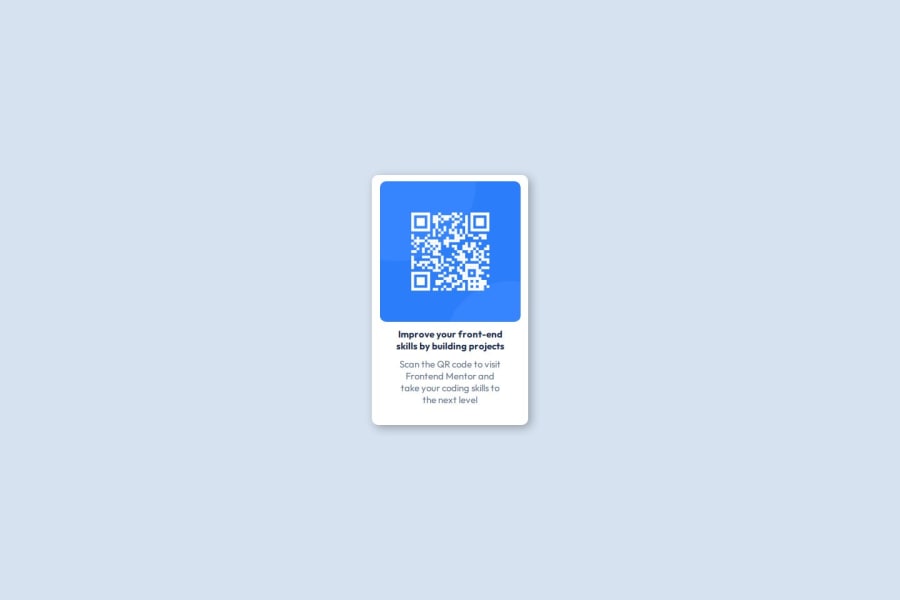
Design comparison
Solution retrospective
I like what I've accomplished , even though I'm sure it could have been done in fewer lines and perhaps in a most effective way had I been more exposed to flexbox use.
What challenges did you encounter, and how did you overcome them?About elements distribution inside a container with just flexbox ( I particularly wanted to work only with this technique) I had checked some tutorials couple of years ago so I think it definitely helped in some ways and then there were some things I didn't remember and try to do as well as I could. I went to watch and or read some tutorials and of course from legitimate sources like MDN webdocs, etc.
What specific areas of your project would you like help with?I'd like to see first how other people solved the inner distribution of elements (img and text) in the card itself, I called this div #contenedor-int , as in internal container. I applied flexbox and tried to distribute the elements using that technology but it didn't work so I had to apply a margin class to those elements and I don't really liked doing that because it adds to the css file size and doesn't seem so practical. I'm still gonna investigate it of course.
Community feedback
Please log in to post a comment
Log in with GitHubJoin our Discord community
Join thousands of Frontend Mentor community members taking the challenges, sharing resources, helping each other, and chatting about all things front-end!
Join our Discord
