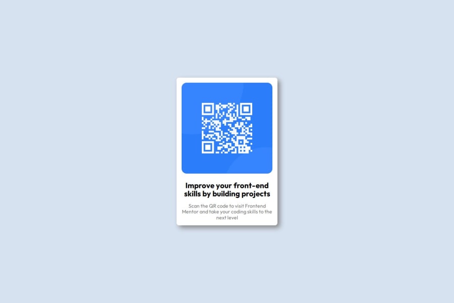
Design comparison
Solution retrospective
I would use semantic tags more - I feel I did pretty well in the CSS which is usually my downside
What challenges did you encounter, and how did you overcome them?I struggled with the Figma file initially - however after some thorough research it got a lot easier on how to use - still a beginner but getting there.
What specific areas of your project would you like help with?I would like to get better at responsive designs more - I want to understand responsive layouts more and when we can use them etc
Community feedback
- @ChiangArtPosted 6 months ago
La solución incluye HTML semantico, aunque creo me falta ser un poco mas responsive. Difiere un poquito creo del diseño pero en parte se ve bien. Veo que mi codigo es legible y esta bien estructurado. Y se ve bien en una variedad de pantallas
Marked as helpful0 - @gmagnenatPosted 6 months ago
This is a duplicate of this one : https://www.frontendmentor.io/solutions/responsive-qr-card-component-3oZOfBeIPr
My review stay the same, there are no differences.
0
Please log in to post a comment
Log in with GitHubJoin our Discord community
Join thousands of Frontend Mentor community members taking the challenges, sharing resources, helping each other, and chatting about all things front-end!
Join our Discord
