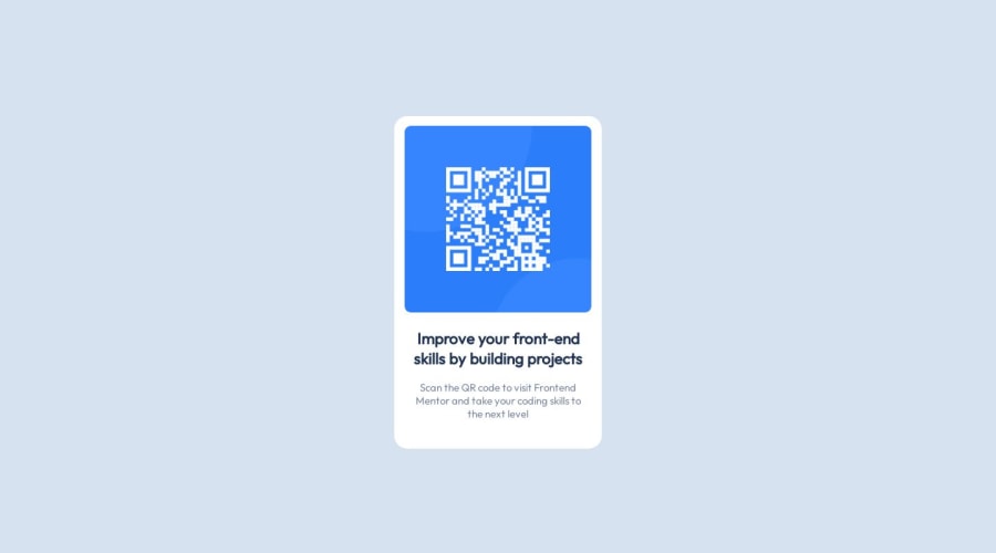
Design comparison
SolutionDesign
Community feedback
- @RatifiedPosted over 1 year ago
Hello @hiro5900
Good job on completing the challenge
Instead of using
margin: 160px auto 0;in your .container div, use flex or grid in your body to center things. Add this to your body and remove the margin on your card.body{ display: grid; align-items: center; justify-content: center; min-height: 100vh; }and now remove this
margin: 160px auto 0;I hope this helps
Marked as helpful1
Please log in to post a comment
Log in with GitHubJoin our Discord community
Join thousands of Frontend Mentor community members taking the challenges, sharing resources, helping each other, and chatting about all things front-end!
Join our Discord
