Not Found
Not Found
Not Found
Not Found
Not Found
Not Found
Not Found
Not Found
Not Found
Not Found
Not Found
Not Found
Not Found
Not Found
Not Found
Not Found
Not Found
Not Found
Not Found
Not Found

Submitted

QR Code component Using React and TailwindCSS

GGSβ€’ 260

@Guilherme-Goncalves-de-Souza

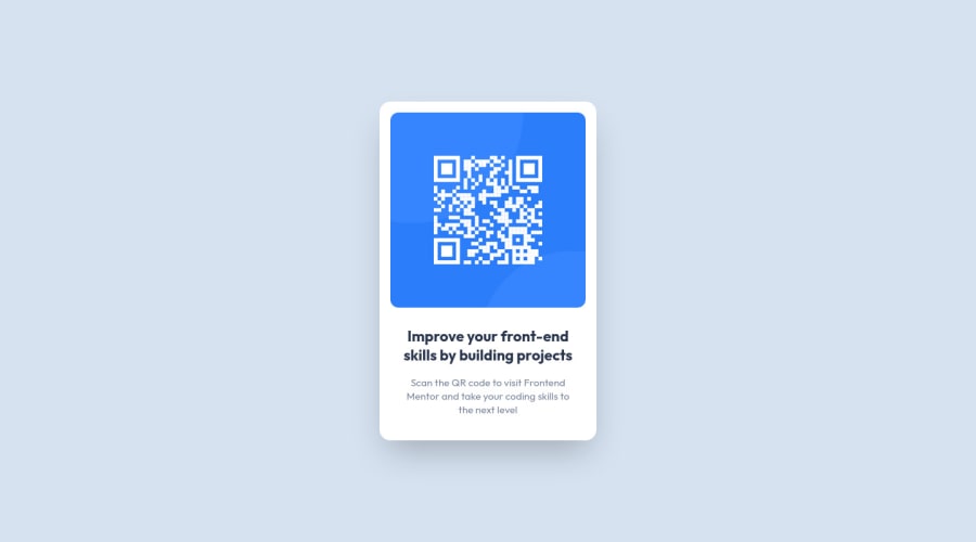
Desktop design screenshot for the QR code component coding challenge

This is a solution for...

  • HTML
  • CSS
1newbie
View challenge

Design comparison


SolutionDesign

Solution retrospective


First project with React and TailwindCSS, what would you improve on the codes?

πŸ‡§πŸ‡· Deixe aqui seu feedback ou sua crΓ­tica construtiva!!!

en Leave your feedback or constructive criticism here!!!

Community feedback

@MelvinAguilar

Posted

Hello there πŸ‘‹. Good job on completing the challenge !

I have some suggestions about your code that might interest you.

  • The width: 100vw property in the body tag is not necessary. This will create a horizontal scrollbar on some devices.
  • The simplest way to set the height of the body element is with min-height: 100vh, setting the height to 100vh on the body element can cause your component to be cut off on small screens, such as a mobile phone in landscape mode.
  • Tip: The lang attribute is used to specify the natural language of the content of an HTML element. This information is used by browsers and assistive technologies, such as screen readers, to adjust their settings and behavior to better suit the content of the page. If the lang attribute is set to pt-BR (Brazilian Portuguese) but the content of the page is in English, screen readers may use Brazilian Portuguese pronunciation rules when reading the English text, which can make it difficult for users to understand.

I hope you find it useful! πŸ˜„ Above all, the solution you submitted is great!

Happy coding!

Marked as helpful

1

GGSβ€’ 260

@Guilherme-Goncalves-de-Souza

Posted

Thank you very much for the feedbacks, I've arranged everyone in my code and i'll use this in my next projects.

Thank you very much @MelvinAguilar !

1
Tux3erβ€’ 780

@Tux3er-Isma

Posted

Hi GGS

I have reviewed your code and looks good πŸŽ‰:

There are some tips for your next project πŸ’‘:

Author ©️:

  • Put who done the project because that can make someone paste and copy your code.

  • Put your Readme.md file in English because not everybody knows Brasilian.

CSS 🎨:

  • For the img hover state use transitions like this:

transition: all 1s;

  • This will make your hover state better.

That's all and have a nice coding πŸ‘¨πŸ»β€πŸ’»!!!

Marked as helpful

1

GGSβ€’ 260

@Guilherme-Goncalves-de-Souza

Posted

Thank you very much for the feedbacks, I've arranged everyone in my code and i'll use this in my next projects.

Thank you very much @Tux3er-Isma!

0

Please log in to post a comment

Log in with GitHub
Discord logo

Join our Discord community

Join thousands of Frontend Mentor community members taking the challenges, sharing resources, helping each other, and chatting about all things front-end!

Join our Discord