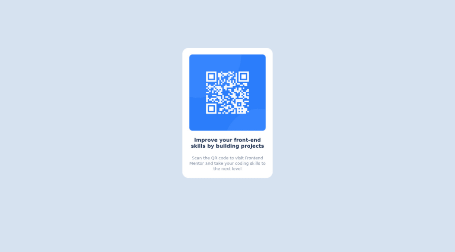
Design comparison
Community feedback
- @HassiaiPosted almost 2 years ago
Replace <div class="container"> with the main tag and <p class="improve"> with <h1> to fix the accessibility issues. click here for more on web-accessibility and semantic html
Give the img a max-width value instead a width and height value,
For a responsive content which won't require a media query for this challenge, give .container a fixed max-width value and a padding value for all the sides. give h1 and p the same padding-left and padding-right values and margin- top values. give p a margin bottom value.
.container{
max-width: 320px;
padding: 15px;
}
img{
max-width: 100%;
}
h1 and p{
padding: 0 15px;
margin-top: 15px;
}
p{
margin-bottom: 15px;
}
Use rem or em as unit for the padding, margin, width and preferably rem for the font-size for more on CSS units Click here
Hope am helpful.
Well done for completing this challenge. HAPPY CODING
Marked as helpful0@WiredSenpaiPosted almost 2 years ago@Hassiai Thank you so much, I will make sure to use these in future
1
Please log in to post a comment
Log in with GitHubJoin our Discord community
Join thousands of Frontend Mentor community members taking the challenges, sharing resources, helping each other, and chatting about all things front-end!
Join our Discord
