Design comparison
Community feedback
- @ofthewildfirePosted over 2 years ago
A good attempt;
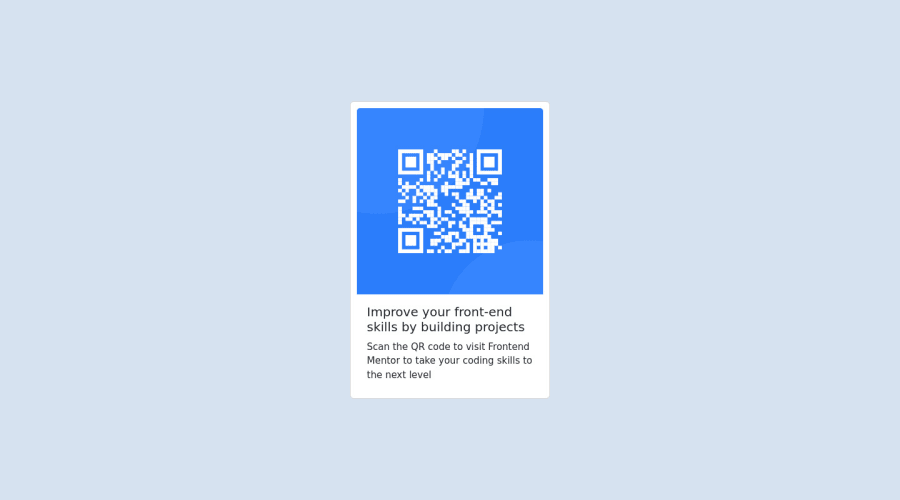
however, paying more attention to the details to make it look as best to the design I think is needed, particularly in these spaces:
-
the corners are rounded in the design so adding a
10px border-radiuson both the card and the QR image would be better, its too sharp in yours (Mind, it might be less or more than 10px, but I am just spit balling here) -
Your font is not actually being imported, may I recommend this resource to see where you've gone wrong there. https://www.w3schools.com/css/css_font_google.asp
-
Again, with the design, following the style-guide, the font weights for both the header and the paragraph need to be different, so do the colours. :)
Hope that helps. :)
Marked as helpful0@Michelle-WanderiPosted over 2 years ago@ofthewildfire thank you. I will do that
0 -
Please log in to post a comment
Log in with GitHubJoin our Discord community
Join thousands of Frontend Mentor community members taking the challenges, sharing resources, helping each other, and chatting about all things front-end!
Join our Discord
