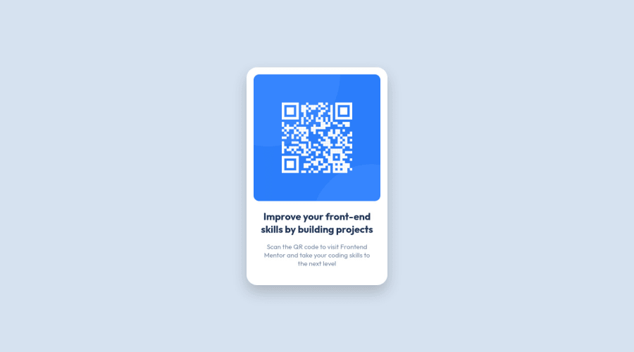
Design comparison
SolutionDesign
Solution retrospective
Hello Everyone.
This one was pretty straight forward.
Estimated time of completion: 2 hours Completed in: 1 Hour 30 Min
Any feedback would be much appreciated👌
Community feedback
- @UrbanskiDevPosted about 2 years ago
Hello Md5 dalton !
Congratulation for finishing this project
I have one little suggestion :
- If you check the responsive of the page (you can check it with your browser dev tools with F12), you will see that your page element shrink in size when the screen is smaller. I saw you added a max-width to stop the element to be too big, it is the same idea to apply with min-width, to stop your page element to be too small.
.card {
  padding: 1rem;
  border-radius: 1.5rem;
  box-shadow: 0 1rem 2rem rgba(0,0,0,.2);
  background-color: var(--color-bg-card);
  max-width: 320px;
  text-align: center;
  min-width: 300px;
}
Otherwise, great job, and keep learning !
Marked as helpful1@md5daltonPosted about 2 years ago@UrbanskiDev I appreciate that. I'll look into it👌
0
Please log in to post a comment
Log in with GitHubJoin our Discord community
Join thousands of Frontend Mentor community members taking the challenges, sharing resources, helping each other, and chatting about all things front-end!
Join our Discord
