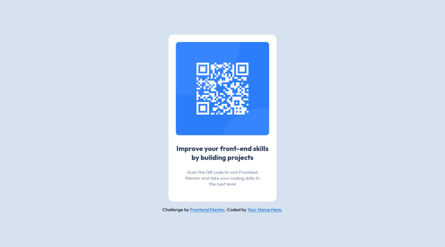
Design comparison
Solution retrospective
A recurring question is how do you know if a component is "pixel perfect". What methods do you use to translate the mockup to development? Thanks!
Community feedback
- @dtomicicPosted over 2 years ago
Well at least for me it's all in the guessing, over time you get a bit better at guessing at the sizes of everything but I doubt you'll ever be pixel perfect without the actual sizes and dimensions and I don't mean this in a bad and mean way I mean this in a good way, you shouldn't even go for the solution to be the exact same size as the one provided your main focus should be good code and usage of best practices. So my suggestion for you would be not to worry to get everything the right size since it's rather a hard task without the proper files but to go for readable, good and best code you can produce and if your header's font size is off by a few pixels it's not that bad :)
If you get the pro or get a job as a frontend developer then you'll get all the files you'll need with all the dimension and you wont have to keep guessing but as I said for a beginner and even for some of more experienced developers you shouldn't worry about everything being pixel perfect but that you get the design right, responsiveness, functionality (if there is some) and all the other stuff and then you can play around with dimensions and sizes to try to get it to that point where it's perfect with the design provided but it's not a priority.
Anyways great job on this one, hope you keep it up :D
Marked as helpful0 - @AdambentleyioPosted over 2 years ago
Hey Shashree. Thanks so much for your observation, I think you're right!
0 - @shashreesamuelPosted over 2 years ago
Hey good job completing this challenge
Keep up the good work
Your solution looks great however I think that the card is missing a subtle box shadow using
box-shadow
.I hope this helps
Cheers Happy coding š
0 - @melwyntPosted over 2 years ago
Hi!
These are the tools you can use to create a pixel perfect website:
- Pixel Perfect Pro - This helps me to display a screenshot on top of the webpage to easily check if dimensions were accurate. This is super useful is you need to create pixel perfect work.
- PX: Viewport Dimensions - This add-on will show you the dimensions of your viewport while resizing your browser.
Other tools:
- Figma - This helped me create a rapid mockup to get dimensions of components.
In case you have a screen smaller than the designs provided (usually they have 1440px in width), you can open the developer tools in Chrome or Firefox and display the page with the exact dimensions you need (desktop or mobile).
0@AdambentleyioPosted over 2 years ago@melwynt Thank you Melwyn. Those extensions look super useful. I'll check them out. Could you elaborate on how you use Figma in relation to the FEM challenges?
0@melwyntPosted over 2 years ago@Adambentleyio sure. You can use Figma to create a mockup. I would import the screenshot and then "draw" the different elements (headers, footers, buttons, etc.) over the screenshot. You can give those elements an opacity so you can still see your screenshot below.
This gives me the distances between each elements, their dimensions etc.
Ofcourse this will just give you approximations and so I wouldn't spend much time on it.
But in general, I think it's worth learning how to use Figma since it's a great tool to share with other people your designs, etc. It was built for collaborative work so that makes it ideal.
0
Please log in to post a comment
Log in with GitHubJoin our Discord community
Join thousands of Frontend Mentor community members taking the challenges, sharing resources, helping each other, and chatting about all things front-end!
Join our Discord