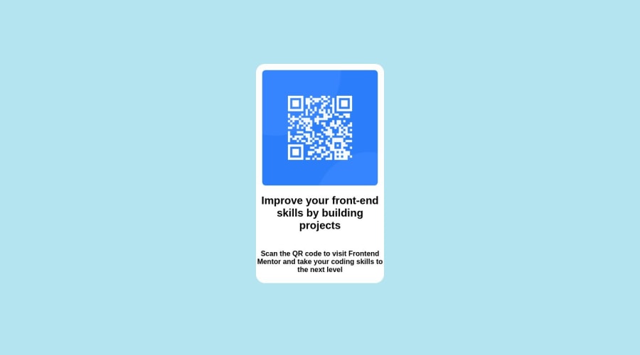
Design comparison
Solution retrospective
Really took me too long to work around and mirror the look with CSS, any shortcuts around that?
Community feedback
- @qaczyPosted over 1 year ago
The shortcut is to use figma or xd files since there you can easily check everything including font attributes. However it's paywall for that here :( With a time, you can easily mock things by just seeing it. Using live preview during coding/styling is also helpful.
A few things that you can improve:
- add font that was mentioned in style-guide.md
- add media queries for 2 resolution as it was stated in style-guide.md
- change h4 to p, two headers in such card are not necessary especially when it's continuation of previous header
0@killshotroxsPosted over 1 year ago@qaczy Thanks for the inputs man, really appreciate it 😊.
0
Please log in to post a comment
Log in with GitHubJoin our Discord community
Join thousands of Frontend Mentor community members taking the challenges, sharing resources, helping each other, and chatting about all things front-end!
Join our Discord
