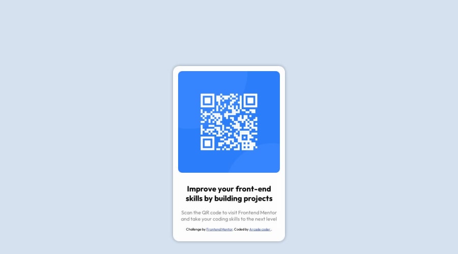
Design comparison
SolutionDesign
Solution retrospective
What are you most proud of, and what would you do differently next time?
Doing this in less than 30 minutes
What challenges did you encounter, and how did you overcome them?Forgetting how to center a div in the middle of a webpage.
What specific areas of your project would you like help with?None
Community feedback
- @sivaprasath2004Posted 11 months ago
Hello I`m wishing for your completion project.
- I will see your solution you trying to center the
.carduse withmargin-top: 100pxthis is not proper alignment. To easily center the.card, I suggest using.centre { display: flex; align-items: center; justify-content: center; margin: 1rem;}. This method is simpler and more effective, especially formobileandtabletmodes. - Additionally, adjusting the
.attributionat the last end of the content to add in your CSS property.attribution{position: absolute; bottom: 0%; }
0 - I will see your solution you trying to center the
- @willengarciaPosted 11 months ago
Poderia ter colocado menos div, para deixar a leitura do html mais "Limpo". Mas a ideia foi ótima, e ainda soube melhorar o projeto.
0
Please log in to post a comment
Log in with GitHubJoin our Discord community
Join thousands of Frontend Mentor community members taking the challenges, sharing resources, helping each other, and chatting about all things front-end!
Join our Discord
