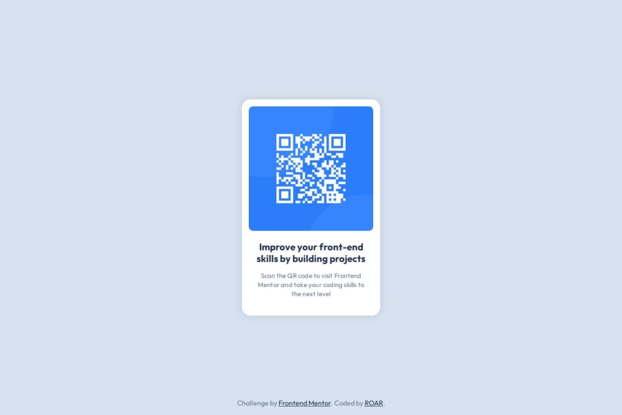
Design comparison
Solution retrospective
As a beginner, I created several divs and CSS selectors on my first attempt. I realized that this approach was inefficient, so I decided to read and watch tutorials on HTML and CSS. On my second attempt, I managed to reduce the number of lines by grouping elements more efficiently.
What challenges did you encounter, and how did you overcome them?I am not yet familiar with CSS variables, so I ended up going back and forth with the style guide to ensure accuracy and achieve a pixel-perfect design. If I had used CSS variables, it would probably have sped up the process. I’ll make sure to implement CSS variables in my future projects.
What specific areas of your project would you like help with?So far, I have not encountered any major issues in this project. However, with my limited knowledge, this path feels a bit unclear, and I’m not sure what questions to ask yet. I’ll continue to explore and learn so that I can seek feedback and guidance on specific areas in future projects.
Community feedback
- @Grimm-NPosted 5 months ago
Your work is looking fantastic—seriously, keep it up! 🌟 Every step forward shows your dedication.
Here are a few pointers to make it even better:
1️⃣ Pixels? Try switching to
em,rem, or%instead. They’re way more flexible and adapt beautifully to different screen sizes. This helps your designs stay consistent across devices. 📱✨2️⃣ On smaller screens, set your card width to
90vwor90%. This keeps it clean and prevents it from sticking awkwardly to the edges. It’s a game-changer for responsive layouts! 🖼️3️⃣ Always give your elements classes! It makes your code more manageable and readable. Plus, following the BEM (Block-Element-Modifier) method keeps everything structured. Example:
<div class="card card__image card__image--highlighted"></div>BEM keeps your styles clear and scalable, especially as your project grows. 🚀
Keep up the amazing work—you’re absolutely smashing it! 💪🎉
2 - @thecodefanPosted 5 months ago
This design looks solid! i also had problems with using too many divs, and my positions were inefficient at best, though they got the job done, hopefully i can fix it up like you have in the future.
1
Please log in to post a comment
Log in with GitHubJoin our Discord community
Join thousands of Frontend Mentor community members taking the challenges, sharing resources, helping each other, and chatting about all things front-end!
Join our Discord
