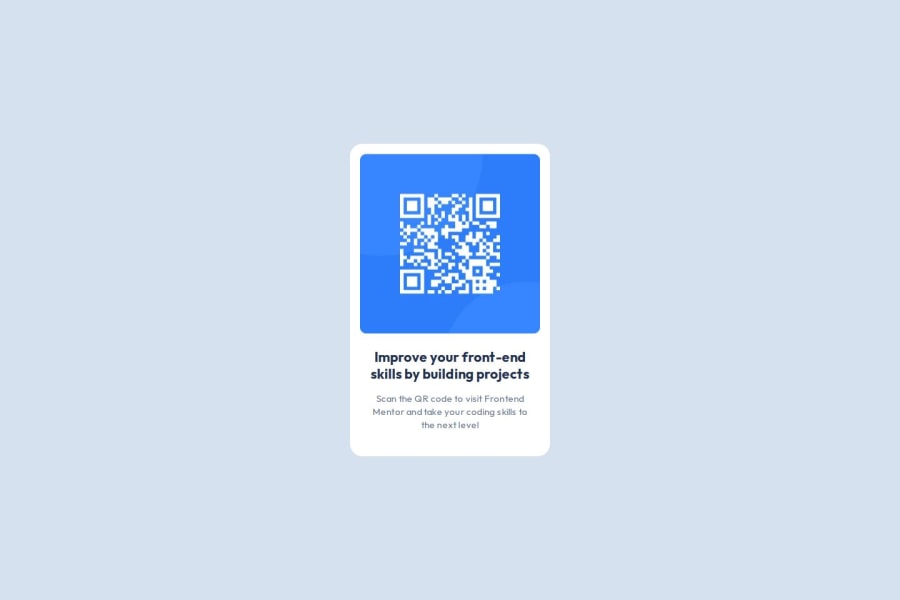
QR Code Component
Design comparison
Solution retrospective
I'm most proud of the clean, maintainable code I wrote, including modular SCSS with BEM naming conventions. I also achieved a pixel-perfect design, scored 100 across all categories in Lighthouse, and ensured the project was fully responsive.
Next time, I would focus on optimizing the development process further by incorporating more automation tools and exploring additional performance improvements.
What challenges did you encounter, and how did you overcome them?One challenge I faced was achieving pixel-perfect accuracy. While working from the Figma design mockup, I noticed that the distance between the image and the heading didn't look quite right at the specified 24px. To resolve this, I adjusted it to 21px, which visually matched the design better. This small tweak allowed me to maintain the intended look and feel while still adhering closely to the original design.
What specific areas of your project would you like help with?I’m curious about why I couldn’t achieve pixel-perfect accuracy with the 24px spacing as specified in the design. Despite using the image from the design as a guide to check for pixel perfection, I had to adjust the spacing to 21px to match the design visually. I’d appreciate any insights or feedback on why this discrepancy might have occurred and how I can avoid similar issues in the future.
Community feedback
Please log in to post a comment
Log in with GitHubJoin our Discord community
Join thousands of Frontend Mentor community members taking the challenges, sharing resources, helping each other, and chatting about all things front-end!
Join our Discord
