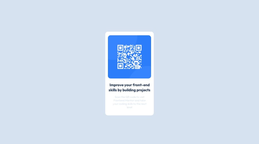
Design comparison
Solution retrospective
Hi there, I’m Sae and this is my solution for this challenge👋
Any feedback on how I can improve code are more than welcome!
Thank you.
Community feedback
- @0xabdulkhaliqPosted almost 2 years ago
Hello there 👋. Congratulations on successfully completing the challenge! 🎉
- I have other recommendations regarding your code that I believe will be of great interest to you.
QR iMAGE ALT TEXT 📸:
- The QR Code Component involves scanning the QR code, the image is not a decoration, so it must have an
altattribute which should explain the purpose of theimage.
- The
altwithQR codeis not even explaining for what the QR image need to be used.
- So update the
altwith meaningful text which explains likeQR code to frontendmentor.io
- Example:
<img src="/images/image-qr-code.png" alt="QR code to frontendmentor.io">
.
I hope you find this helpful 😄 Above all, the solution you submitted is great !
Happy coding!
0@SaeM843Posted almost 2 years agoHi @0xAbdulKhalid Thank you very much for the feedback. It is now updated:)
0 - @HassiaiPosted almost 2 years ago
Replace <div class="card"> with the main tag to make the content/page accessible. click here for more on web-accessibility and semantic html
To center .card on the page using flexbox, replace the height in the body with
min-height: 100vh.To prevent the content from overflowing, there is no need to give .card a height value rather give the same padding value for all the sides.
padding: 16px which is 1em/remGive the img a max-width of 100% instead of a fixed width value and a border-radius value, the rest are not needed.
Give p a font-color of hsl(220, 15%, 55%); for the faded color.
Hope am helpful.
Well done for completing this challenge. HAPPY CODING
0@SaeM843Posted almost 2 years agoHi @Hassiai, Thank you very much for the feedbacks! It is now updated and also thank you for the articles you shared here, which were so helpful:)
0 - @Danish49Posted almost 2 years ago
Replace the div class card with a main tag for accessibility and semantics and pay a little attention towards the font color and size of the design. Rest is nice 👍🏻 congratulations for completing your first challenge keep coding.
0@SaeM843Posted almost 2 years agoHi @Danish49, Thank you very much for the feedback:) I updated the project with your feedbacks.
0
Please log in to post a comment
Log in with GitHubJoin our Discord community
Join thousands of Frontend Mentor community members taking the challenges, sharing resources, helping each other, and chatting about all things front-end!
Join our Discord
