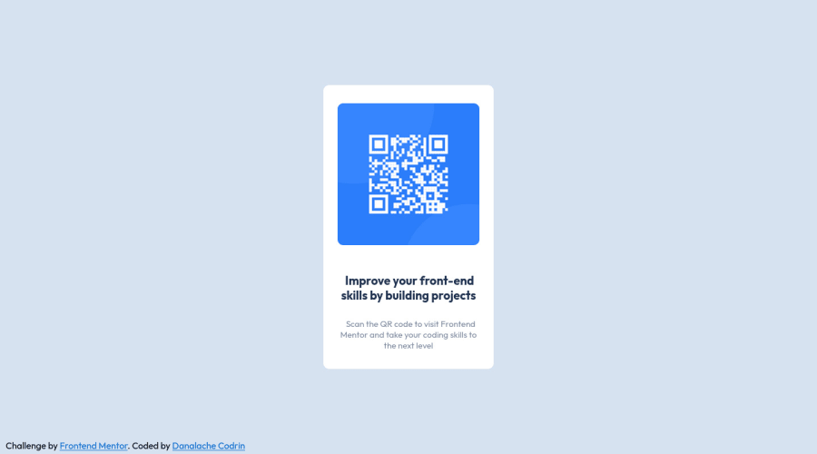
Design comparison
Solution retrospective
Feedback welcome!
Community feedback
- @correlucasPosted about 2 years ago
👾Hi @cdr-in, congratulations on your solution!👋 Welcome to the Frontend Mentor Coding Community!
Great solution and a great start! From what I saw you’re on the right track. I’ve few suggestions for you that you can consider adding to your code:
Reduce your code by removing unnecessary elements. The HTML structure is working but you can reduce at least 20% of your code by cleaning the unnecessary elements, you start cleaning it by removing some unnecessary
<div>. For this solution you wrap everything inside a single block of content using<div>or<main>(better option for accessibility) and put inside the whole content<img>/<h1>and<p>.<body> <main> <img src="./images/image-qr-code.png" alt="QR Code Frontend Mentor" > <h1>Improve your front-end skills by building projects</h1> <p>Scan the QR code to visit Frontend Mentor and take your coding skills to the next level</p> </main> </body>Here's my solution for this challenge if you wants to see how I build it: https://www.frontendmentor.io/solutions/qr-code-component-vanilla-cs-js-darklight-mode-nS2aOYYsJR
✌️ I hope this helps you and happy coding!
0
Please log in to post a comment
Log in with GitHubJoin our Discord community
Join thousands of Frontend Mentor community members taking the challenges, sharing resources, helping each other, and chatting about all things front-end!
Join our Discord
