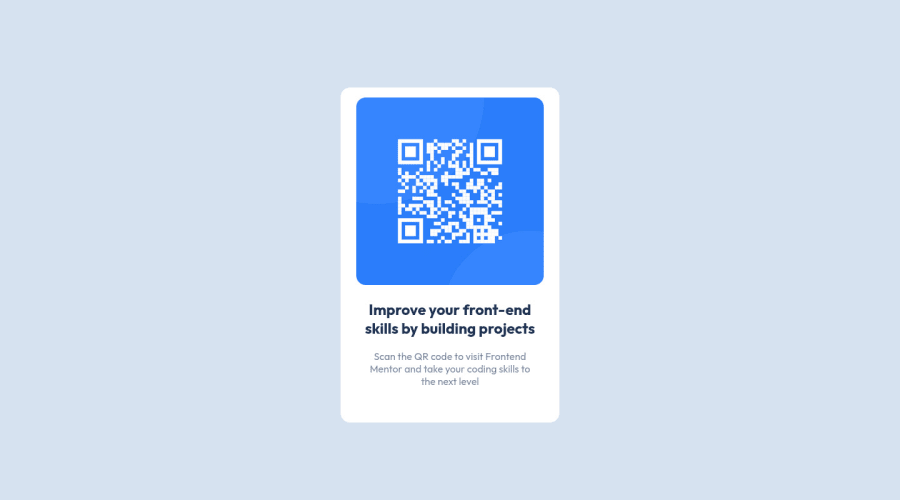
Design comparison
Solution retrospective
Hey Guys, this is the first successful project | made on here, It looks kinda similar, | struggled with the box shadow and couldn't get it so | left it.
PS: I now realised that that image is not showing up and dont know whats the problem.
if you have any advice on how | could do it better please comment | would appreciate it.
Thank you
Community feedback
- @MelvinAguilarPosted almost 2 years ago
Hi there π. Good job on completing the challenge !
In addition to the other suggestions I have some feedback for you if you want to improve your code.
HTML:
- Use the
<main>
tag to wrap all the main content of the page instead of the<div>
tag. With this semantic element you can improve the accessibility of your page.
- Use the
<footer>
tag to wrap the footer of the page instead of the<div class="attribution">
. The<footer>
element contains information about the author of the page, the copyright, and other legal information.
- You must use a level-one heading (h1) even though this is not a full-page challenge. You can create an '<h1>' element within your 'main' element that will be hidden visually but visible and readable by screen readers. The class "sr-only" hides content visually and here are the styles to copy. e.g.:
<h1 class="sr-only">QR Card Component</h1>
- The
<br>
tag is not a semantic element. If a screen reader user is reading the page, they will hear "line break", which breaks the flow of the content. Instead, use CSS properties likemargin
andpadding
to add vertical space between elements.
- The
alt
attribute should explain the purpose of the image. Uppon scanning the QR code, the user will be redirected to the frontendmentor.io website, so a betteralt
attribute would beQR code to frontendmentor.io
- The
alt
attribute should not contain the words "image", "photo", or "picture", because the image tag already conveys that information.
If you want to learn more about the
alt
attribute, you can read this article.CSS:
- Instead of using pixels in font-size, use relative units like
em
orrem
. The font-size in absolute units like pixels does not scale with the user's browser settings. This can cause accessibility issues for users who have set their browser to use a larger font size. You can read more about this here.
- You should use the
border-box: box-sizing
property to make thewidth
andheight
properties include the padding and border of the element. This will make it easier to calculate the size of an element. You can read more about this here.
I hope you find it useful! π Above all, the solution you submitted is great!
Happy coding and Happy New Year! πππ
Marked as helpful2@Beshr-alkhabourPosted almost 2 years ago@MelvinAguilar thanks for the Information you provided. I will implement these in my next Project on here ;) Happy New Year π
1 - Use the
- @JaryCruzPosted almost 2 years ago
Box shadow is surely a tricky concept to understand at first but, with practice, you'll eventually get it. I recommend reading the documentation for box-shadow so you can better understand how it works if you haven't at: https://developer.mozilla.org/en-US/docs/Web/CSS/box-shadow . Other than that, you did a great job. Congrats on completing your first project!
Marked as helpful2@Beshr-alkhabourPosted almost 2 years ago@JaryCruz thank you for your reply, I will read it because I was so confused like whaaat! PS: Happy New Year π
1
Please log in to post a comment
Log in with GitHubJoin our Discord community
Join thousands of Frontend Mentor community members taking the challenges, sharing resources, helping each other, and chatting about all things front-end!
Join our Discord