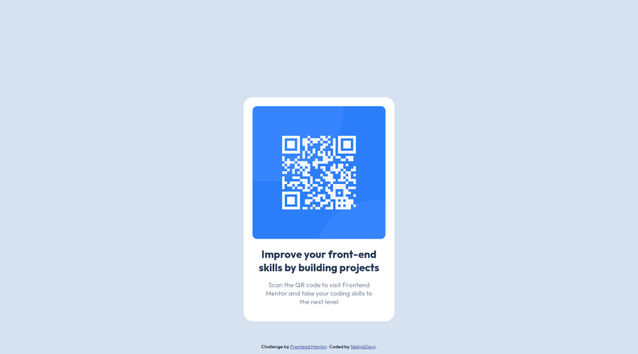
Design comparison
Solution retrospective
-
This first project was straight forward and pretty fun to complete overall. The only issue I ran into the first time was making it mobile friendly, after I switched to flex box it, that issue was solved.
-
Centering my QR code to the center of my container was something I feel I could have done better, instead of doing this inside of CSS I opted for the <center> tag in html.
-
Is there any guides on how professional web developers set up their CSS files?
Community feedback
- @byronbyronPosted about 3 years ago
Nice job @NellyisDevv
I would avoid using the
<center>tag as it's well out of date, and no longer recommended.To display your QR code a tiny bit better on really small screen widths (around 320px) I would do something like this:
.qr-container-background {
    background-color: var(--White-);
    padding: 20px;
    border-radius: 20px;
    max-width: 320px; /* Set max width of card */
    width: 100%; /* Full width up until 320px */
}

.qr-container-photo img {
    border-radius: 10px;
    width: 100%; /* Set image to fill width of the container */
    height: auto;
}
For a small project like this, I think your CSS file set up is absolutely fine!
Also, you've got a few Accessibility/Html issues that you could resolve for a perfect score.
Marked as helpful0
Please log in to post a comment
Log in with GitHubJoin our Discord community
Join thousands of Frontend Mentor community members taking the challenges, sharing resources, helping each other, and chatting about all things front-end!
Join our Discord
