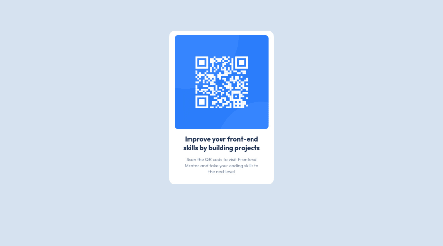
Design comparison
Community feedback
- @denieldenPosted about 3 years ago
Hi Rio, great work on this challenge! 😉
Here are a few tips for improve your code:
- add descriptive text in the
altattribute of the images - remove all
marginfromcontainerclass - use flexbox to the body to center the card. Read here -> best flex guide
- after, add
min-height: 100vhto body because Flexbox aligns child items to the size of the parent container
Overall you did well 😁 Hope this help!
Marked as helpful1 - add descriptive text in the
- P@MeltedGreenVelvetPosted about 3 years ago
On my monitor, your container is not centered horizontally or vertically, so that's why it's not lining up as it should in the design comparison screenshot. The alignment is significantly off when I visit your preview site. Have you considered utilizing flexbox? I feel that it's so much easier to perfectly and responsively center a container that way, and you'll have more flexibility with other forms of alignment in the future.
Other than the alignment issue, I feel that your component looks great!!
Marked as helpful1
Please log in to post a comment
Log in with GitHubJoin our Discord community
Join thousands of Frontend Mentor community members taking the challenges, sharing resources, helping each other, and chatting about all things front-end!
Join our Discord
