Design comparison
Community feedback
- P@schindlerdumagatPosted 6 months ago
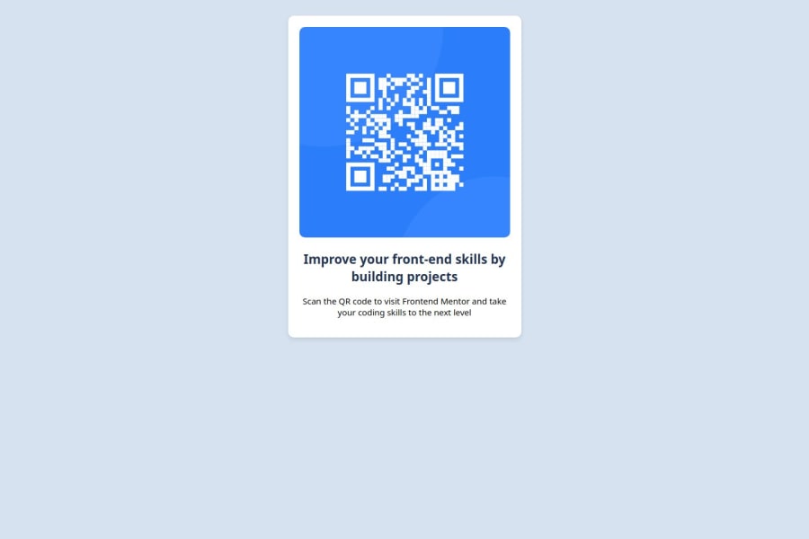
The card is not positioned in the middle of the page. Upon inspecting your styles.css, you have used flexbox to move it to the center. There is just one thing missing, you haven't specified the total height of the body element which you specified as the flexible containing element by giving it a display of flex and it defaulted to the height of the card. Make sure to set the height of the body element to the total height of the browser window because flexbox also takes into consideration the height and width of the flexible containing element.
You can do this by giving it a css rule of:
height: 100vh;0
Please log in to post a comment
Log in with GitHubJoin our Discord community
Join thousands of Frontend Mentor community members taking the challenges, sharing resources, helping each other, and chatting about all things front-end!
Join our Discord
