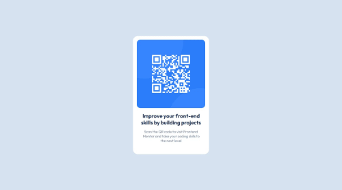
Design comparison
Solution retrospective
The Figma template makes adjusting width and height so convenient.
What challenges did you encounter, and how did you overcome them?Centering divs is quite challenging, I have to ask ChatGPT.
What specific areas of your project would you like help with?I've used CSS media queries in this project, I'm not sure if it's necessary or not, please let me know.
Community feedback
- @DylandeBruijnPosted 4 months ago
@Drewizzz
Hiya! 👋
Congratulations on your solution, it looks very close to the design! I can tell you put a lot of effort into it.
Things I like about your solution 🎉
- Clear descriptive CSS classes
- Use of ChatGPT to help you learn, make sure you understand the code it spits out though. Try not to just copy and paste
- Good use of Figma as a tool
Things you could improve ✍️
-
Change
height: 100vh
tomin-height: 100vh
on thebody
element so it's100vh
at a minimum but can still grow when the content inside it grows. -
Try using CSS custom properties, they help you make your CSS values more reusable and descriptive.
-
Try using more semantic HTML elements. Wrap your main content in a
<main>
for example. -
Try keeping the
height
of your.container
element fluid. At the moment you have a fixedwidth
andheight
which causes overflow issues when the content inside your card grows. -
It's not necessary to have a
<div>
around your image. You can style the image itself and achieve the same result. -
Try using relative units like
rem
andem
for your text.
I hope you find my feedback valuable, and I would appreciate it greatly if you could mark my comment as helpful if it was! 🌟
Let me know if you have more questions and I'll do my best to answer them. 🙋♂️
Happy coding! 😎
Marked as helpful0
Please log in to post a comment
Log in with GitHubJoin our Discord community
Join thousands of Frontend Mentor community members taking the challenges, sharing resources, helping each other, and chatting about all things front-end!
Join our Discord