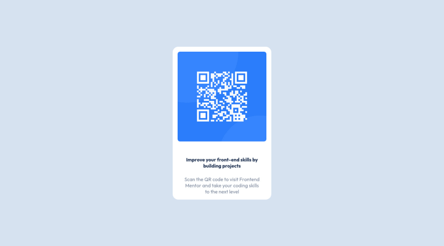
Design comparison
SolutionDesign
Community feedback
- @MelvinAguilarPosted almost 2 years ago
Hello there 👋. Good job on completing the challenge !
I have some suggestions about your code that might interest you.
HTML 📄:
- Since this component involves scanning the QR code, the image is not a decoration, so it must have an
altattribute. Thealtattribute should explain its purpose. e.g.QR code to frontendmentor.io
CSS 🎨:
- Instead of using pixels in font-size, use relative units like
emorrem. The font-size in absolute units like pixels does not scale with the user's browser settings. This can cause accessibility issues for users who have set their browser to use a larger font size. You can read more about this here 📘.
- The
width: 100vwproperty in the.contenttag is not necessary. This will create a horizontal scrollbar on some devices.
- The simplest way to set the height of the body element is with
min-height: 100vh, setting the height to 100vh can cause your component to be cut off on small screens, such as a mobile phone in landscape mode.
I hope you find it useful! 😄 Above all, the solution you submitted is great!
Happy coding!
0 - Since this component involves scanning the QR code, the image is not a decoration, so it must have an
- @AhmedMahroussPosted almost 2 years ago
good jop my bro Congrats on completing your challenge!🎊🍻If you have any questions or need further clarification, feel free to reach out to me. Happy Coding! 🎆🎊
0
Please log in to post a comment
Log in with GitHubJoin our Discord community
Join thousands of Frontend Mentor community members taking the challenges, sharing resources, helping each other, and chatting about all things front-end!
Join our Discord
