Design comparison
Solution retrospective
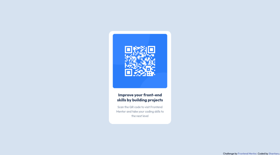
I had some difficulties while working on this project. One of the main challenges was understanding and implementing flexbox to properly align and position the elements on the page. However, through this project, I was able to learn and understand the different properties of flexbox, and was able to use it to create a visually appealing and responsive design. It was a great learning experience and I'm excited to apply this knowledge in my future projects.
Community feedback
- @engsofjvolfePosted almost 2 years ago
Great job bro. I'm going to share font from where i have been learning flexbox (or learned), just in case u hadnt seen them yet.
Take your time to see them:
Positioning the frog using flexbox A Complete Guide to Flexbox
The first one helped me a lot to gain memory on container and particularly item properties for flexbox. If u hadnt seen them yet, try it...
I wish u the best. Happy coding
Marked as helpful0@shantanufsdPosted almost 2 years ago@engsofjvolfe Thank you for the resources, I will definitely check them out! Flexbox is definitely a powerful tool and I'm glad I was able to improve my skills with it on this project. Thanks for the support!
0 - @D4R0MPosted almost 2 years ago
Great job on tackling the challenge of understanding and implementing flexbox in this project. Your efforts have paid off as the design is visually appealing and responsive. Keep up the good work and keep using your new knowledge in future projects
1@shantanufsdPosted almost 2 years ago@D4R0M Thank you for the encouragement! I'm glad to hear that my efforts have paid off. I definitely plan to continue using flexbox in future projects and keep honing my skills. Thanks for the feedback!
0
Please log in to post a comment
Log in with GitHubJoin our Discord community
Join thousands of Frontend Mentor community members taking the challenges, sharing resources, helping each other, and chatting about all things front-end!
Join our Discord