Design comparison
Community feedback
- @mudasirNadeemPosted about 2 months ago
Semantic HTML: The solution effectively uses semantic HTML elements, which enhances both accessibility and SEO. Using appropriate tags (like <header>, <nav>, <main>, and <footer>) helps convey the document's structure clearly.
Accessibility: Overall, the design is quite accessible. However, consider adding ARIA labels for better screen reader support and ensuring that color contrast ratios meet WCAG standards. Including keyboard navigation support would further improve accessibility.
Responsive Layout: The layout adapts well across various screen sizes, showcasing a strong mobile-first approach. It maintains usability and aesthetics on both mobile and desktop views. Testing on additional devices could help refine any minor issues.
Code Structure: The code is well-structured and readable, with clear class naming conventions that promote reusability. Including comments to explain more complex sections could further enhance clarity for future developers.
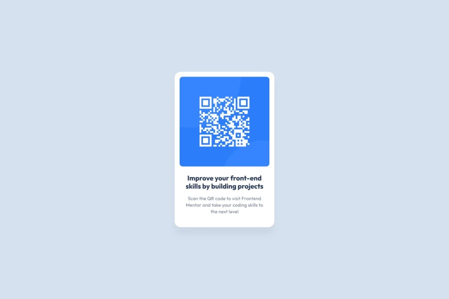
Design Consistency: The solution aligns closely with the original design specifications, maintaining key visual elements and functionality. Any minor discrepancies could be addressed by comparing with the design mockup to ensure alignment.
Marked as helpful1@fr4nbttPosted about 2 months ago@mudasirNadeem
Thank you for the feedback.
I will be working on improving my solution based on that.
1
Please log in to post a comment
Log in with GitHubJoin our Discord community
Join thousands of Frontend Mentor community members taking the challenges, sharing resources, helping each other, and chatting about all things front-end!
Join our Discord
