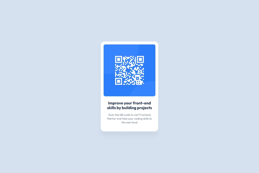
Design comparison
Community feedback
- @franciscusagnewPosted 3 months ago
Hello Steven,
Excellent work on this challenge! Your code is well structured, readable, reusable, and doesn't differ from the design requirements. The only recommendations that I have are that you make provisions for your solution to be responsive for smaller screen sizes as your padding spaces around your image shrink on smaller screens and to make the elements more accessible by maybe inserting your code inside a <main> & <footer> element like so:
<body>
  <main class="qrCard">
    <img src="assets/images/image-qr-code.png" alt="QR code">
    <h1>Improve your front-end skills by building projects</h1>
    <p>Scan the QR code to visit Frontend Mentor and take your coding skills to the next level</p>
  </main>
  <footer class="attribution">
    <p>Challenge by <a href="https://www.frontendmentor.io?ref=challenge" target="_blank">Frontend Mentor</a>. Coded by <a href="https://www.frontendmentor.io/profile/SteveNoyes">Steven Noyes</a>.</p>
  </footer>
</body>
Cheers,
Franciscus
0 - @josef5Posted 3 months ago
Consider extending the height of your main area so it aligns with the design preview, that will make it easier to compare. Have another look at your corner radiuses, your line-heights and your margins. Its hard to tell with the slider but your overall width might be off too. Hope that helps.
0
Please log in to post a comment
Log in with GitHubJoin our Discord community
Join thousands of Frontend Mentor community members taking the challenges, sharing resources, helping each other, and chatting about all things front-end!
Join our Discord
