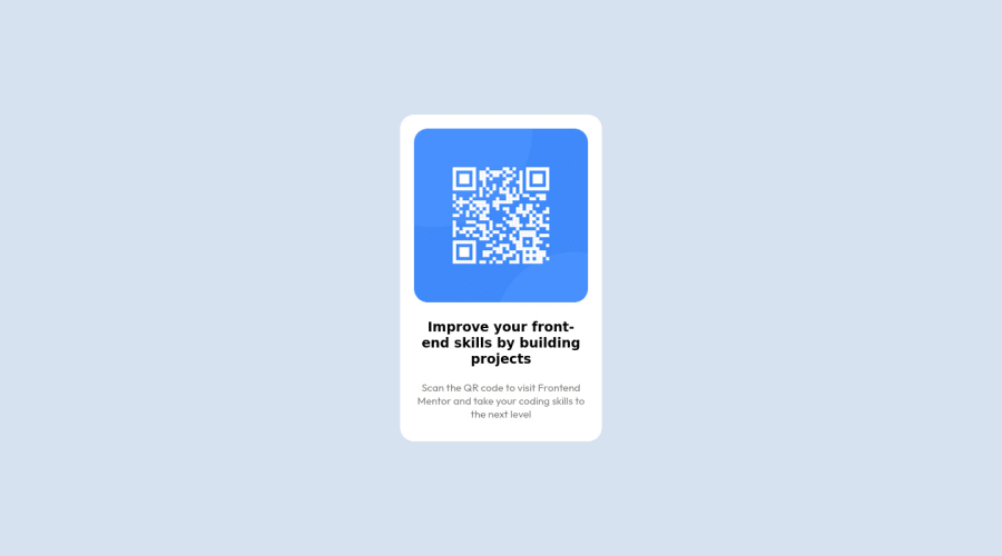
Design comparison
Solution retrospective
My first assignment on FM platform. Any feedback is welcome :)
Community feedback
- @malek-btPosted almost 2 years ago
Hey !, how are you ? I really liked the result of your project, but I have some tips that I think you will enjoy:
*Move the class container to the <main> tag to fix the accessibility issue.
*Replace the <div > tag width <section > and <article> and remove the attribution class from <div> and make it in the <footer>for semantic page.You can read more about semantic here: HTML Semantic Elements.
*Instead of using pixels in font size, use relative units of measure like rem or em. The font size in absolute length units (px) does not allow users with limited vision to change the text size in some browsers.
*The color of <h3> should be color:
hsl(218, 44%, 22%);The rest is good, I hope those tips will help you! 👍
Marked as helpful1@judzizPosted almost 2 years ago@malek-bt Thanks for the feedback. Much appreciate it! I will review it step by step.
Regarding units, i am still learning how to create it to be responsive. Once i master it, i will return to refactor the code. Anyway, thanks again for reviewing my solution and providing me some tips :)
1
Please log in to post a comment
Log in with GitHubJoin our Discord community
Join thousands of Frontend Mentor community members taking the challenges, sharing resources, helping each other, and chatting about all things front-end!
Join our Discord
